
Learning something new is commonly seen as a solo task where each person decides which are the methods and techniques that better suit their needs. It is a process that requires constant self-motivation.
However, is learning restricted to a solo journey? Peer-to-peer learning is a powerful tool that enhances student engagement in learning specific subjects. By debating topics, sharing discoveries, and exchanging feedback with one another, peer-to-peer learning expands their thinking and makes the learning experience more enriching and enjoyable.
About the project
StudySphere is a responsive web application that enables students to connect with others in a respectful learning-friendly community to discuss topics relevant to their fields and specialities enhancing the learning experience.
Let’s Role my role 💃🏻
Study Together brief objective was to create a responsive web application with a focus on UI development to connect students allowing them to discuss and collaborate on tasks related to their studies on any device. The 1-month project took place between February and March 2024 and it is part of the CareerFoundry’s UI specialization course. As a UX Designer , my role and responsibilities ranged from sketching the user flows to creating mockups considering different breakpoints.
- Understanding of the project
- Sketching User Flows
- Defining Layouts and grids
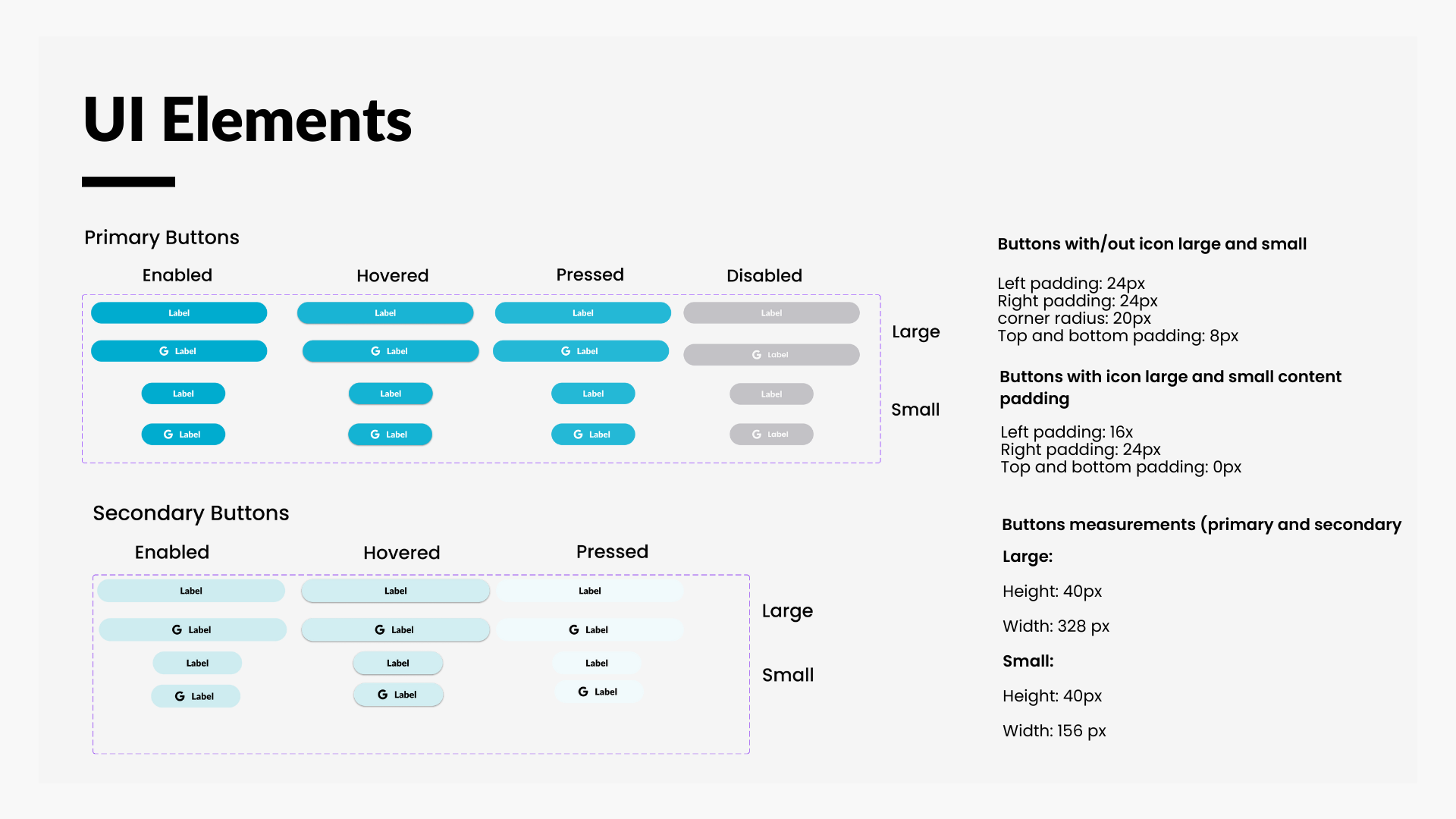
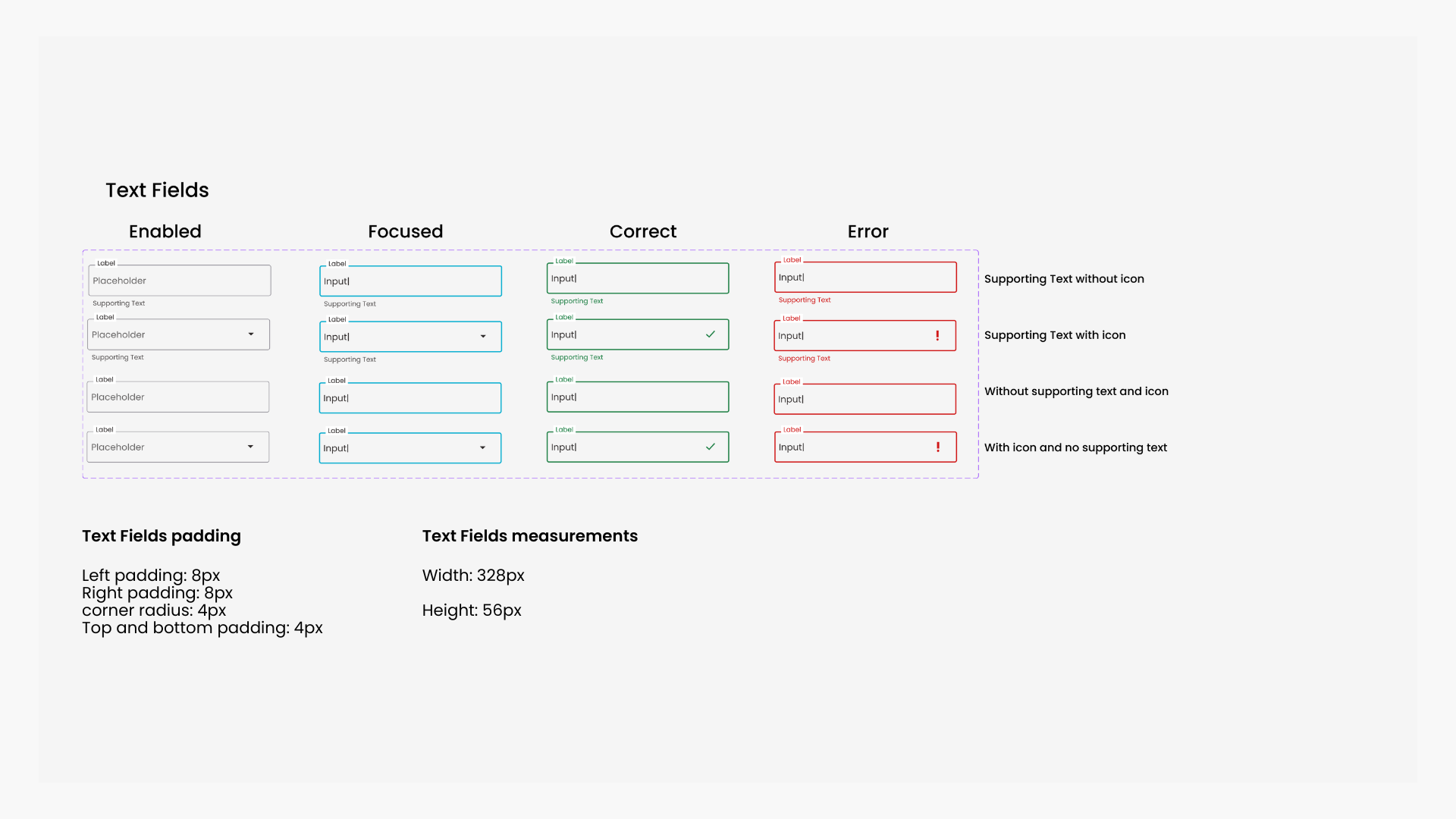
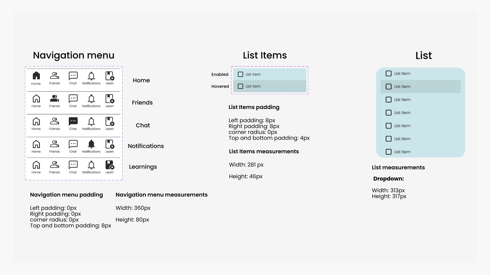
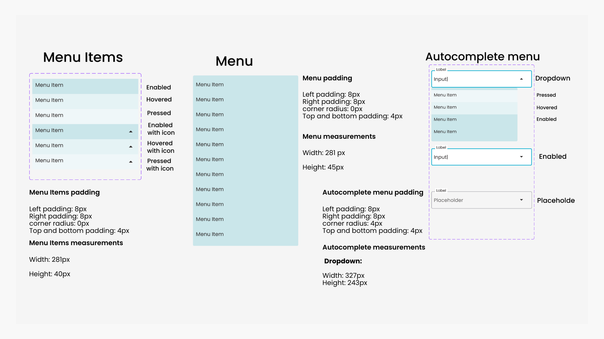
- Creation of UI elements
- Deciding on the colour palette and overall visual assets of the app
- Low, mid and high-fidelity prototyping
- Designing for different breakpoints (responsive design)
- Usage of Figma, Canva, Blush, and Zeplin.
Problem Statement
Students need a way to connect on any device with like-minded students who are studying the same subject so that they can engage and discuss their insights and interests regarding their studies.
How can we create a responsive web application that better covers the communication needs of students and enhances the learning experience at the same time?
Goals
The goal was to focus on features that allowed the users, to:
Create a detailed profile when signing up so that they can find and search each other.
Find other students, filtering the results per subject so that they could work together.
Chat with other users, enhancing the teamwork and collaborative learning experience.
View and share multimedia so that the whole community can share knowledge about different topics related to specific subjects.

Everything starts with an encounter… Meet Alex
With the information from the project brief, I created a user persona to guide me in the development of the project and to help me better understand my user’s needs.

Starting to flow ⛵
Based on the created user persona and user stories provided in the project brief, I developed four user flows to understand how users will navigate the app and accomplish their goals. I focused on the main features and tasks such as creating a profile, finding, and connecting with friends, chatting with other students, and sharing multimedia with the entire learning community.
Low-fidelity wireframes: the always reliable pen and paper 📝
Focusing on mobile-first design I focused on capturing basic wireframes, enhancing the general navigation of the already mapped user flows. The main objective was to visualize the user’s interaction with each core feature, button, and wireframe by bulding a low-fidelity prototype.

Mid-fidelity: Detailing the ideas 👩🏻💻
As the next step, I developed in greater detail my wireframes, conveying form and function by creating specific UI elements and shaping the layout that would impact my user’s navigation, interaction, and completion of goals. I utilized familiar design patterns such as progress indicators, input feedback, and cards to enhance user navigation due to their existing knowledge of the patterns.


Mood Board
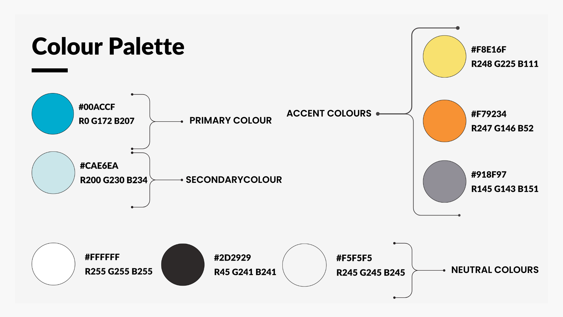
I used the Mood Board method as a first step in deciding the visual design direction and style that I wanted to communicate through the design process. It features two shades of blue with vibrant colours, such as yellow and orange, creating a warm, welcoming palette that evokes a relaxing and reassuring atmosphere, while adding energetic and friendly vibes.

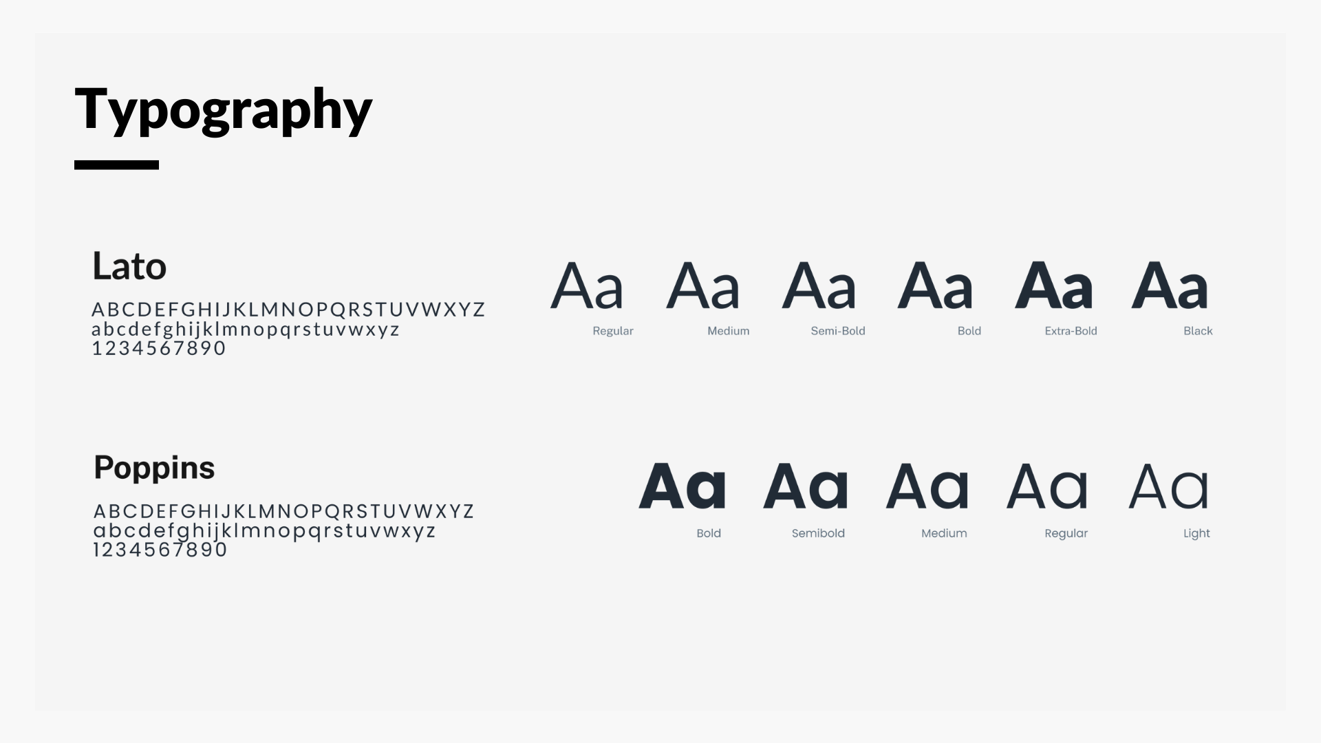
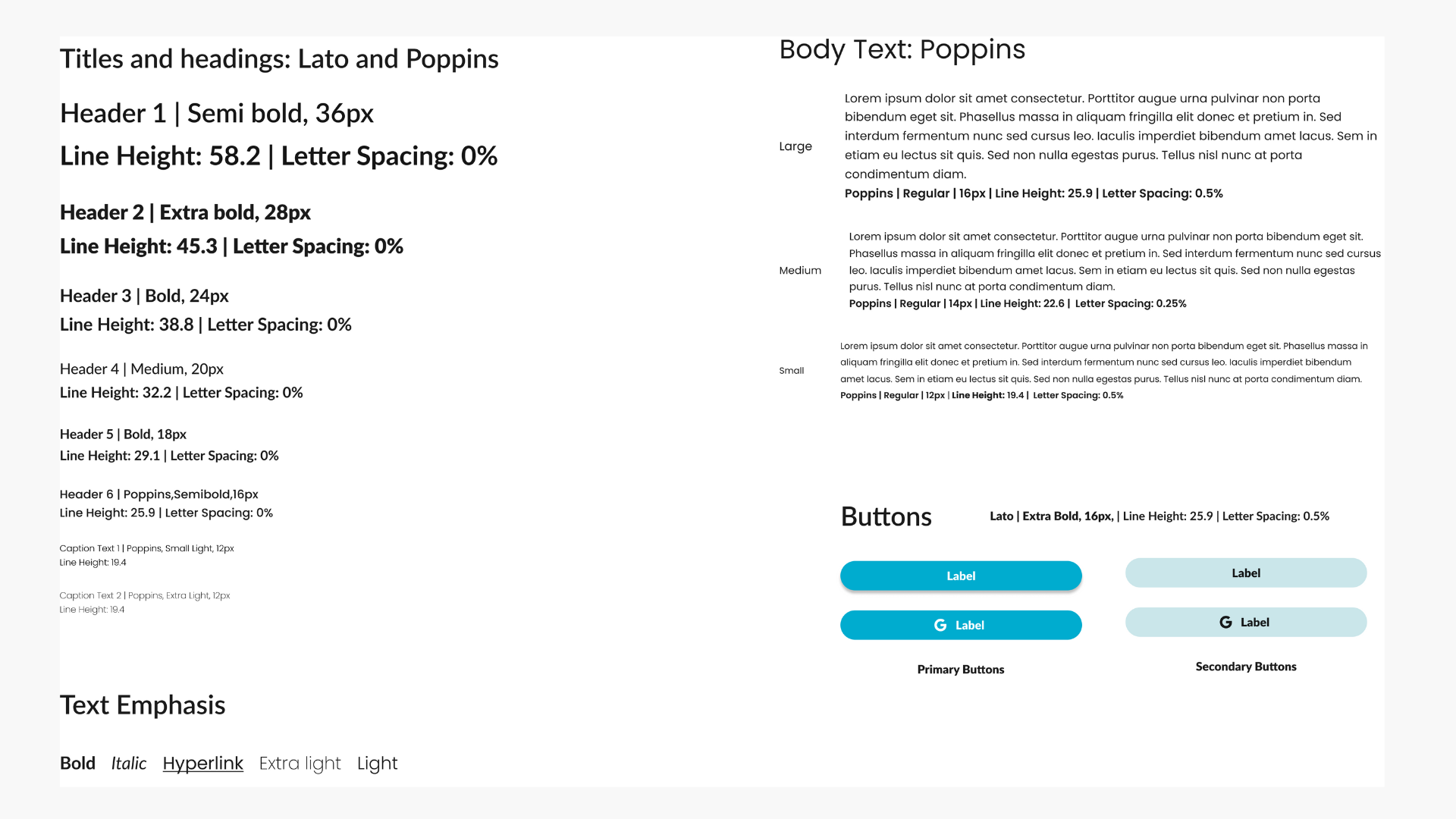
The Poppins and Lato Typography are readable and contain a wide variety of styles. The combination of both typographies is perfect for a web app where users will interact a lot with text in different sizes and elements.
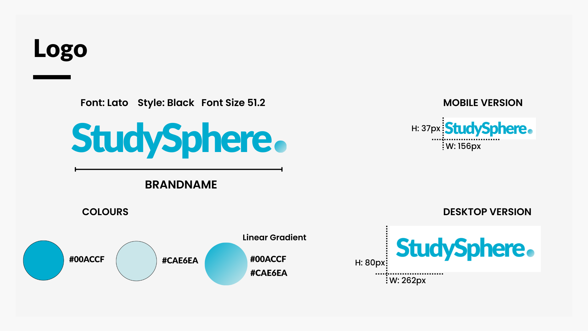
Colouring ideas: Colour Palette 🎨
After deciding on the visual design direction, I developed a colour palette conveying a friendly environment. The selected tones of blue communicate to the users an energising vibe while maintaining a reassuring and calming atmosphere while navigating the app


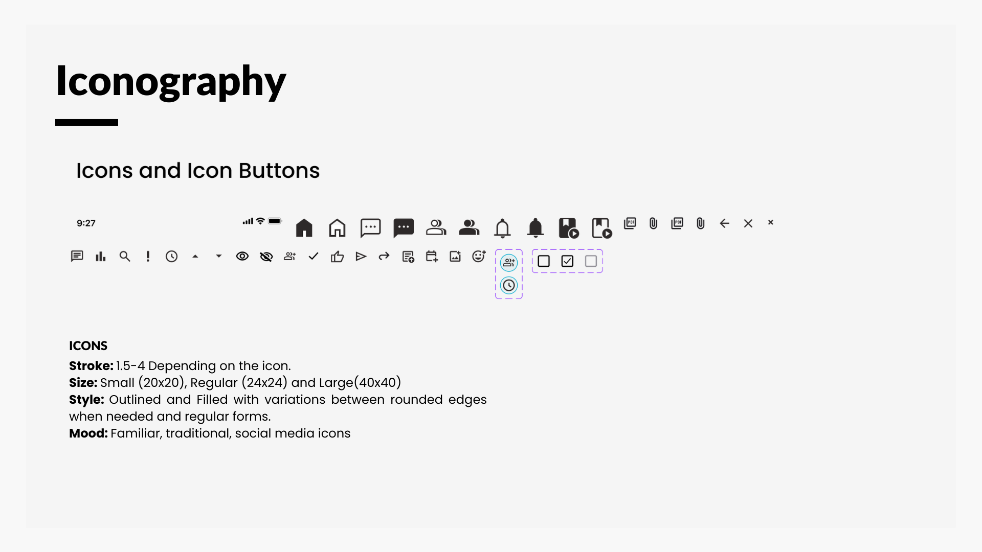
Style Guide
As part of the style guide, I created custom icons to ensure a consistent branding style throughout my wireframes. While doing so, I made sure to keep the familiarity factor in mind so that users could easily navigate the app. The use of the mentioned colours in primary buttons drives the user’s attention to important points of interaction and the use of the complementary colours in specific components enhances the overall experience of the user through the app.
Presenting: StudySphere responsive web app 👏🏼
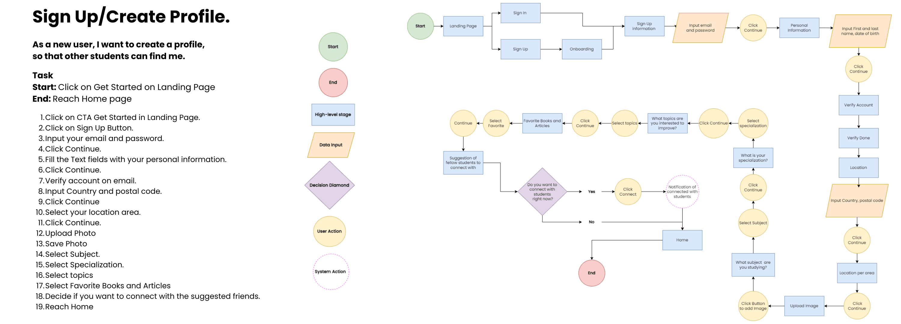
Sign up and create a profile
Taking the user step by step with clear indications of the information needed in each wireframe. Each step covers important information about a user’s profile that would allow the search of other fellow students in a detailed way. Combining progress indicators with other UI components and animations improves the user experience.


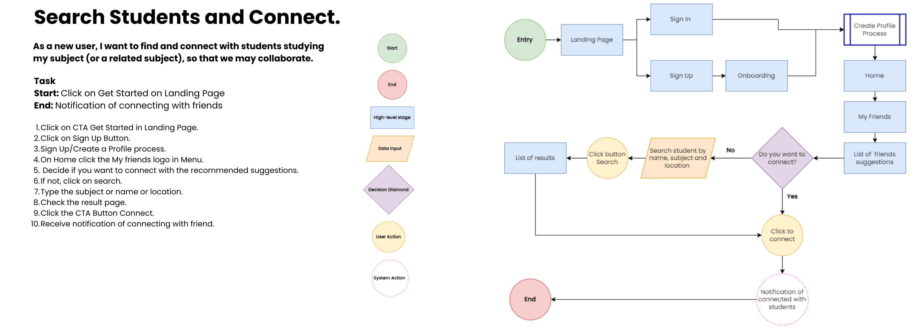
Search students and connect
An autocomplete search feature enables users to find like-minded students based on subject and speciality, making the search process faster and more efficient. The search results have clear buttons, and each category contains the required information to help users decide which user they want to connect with.
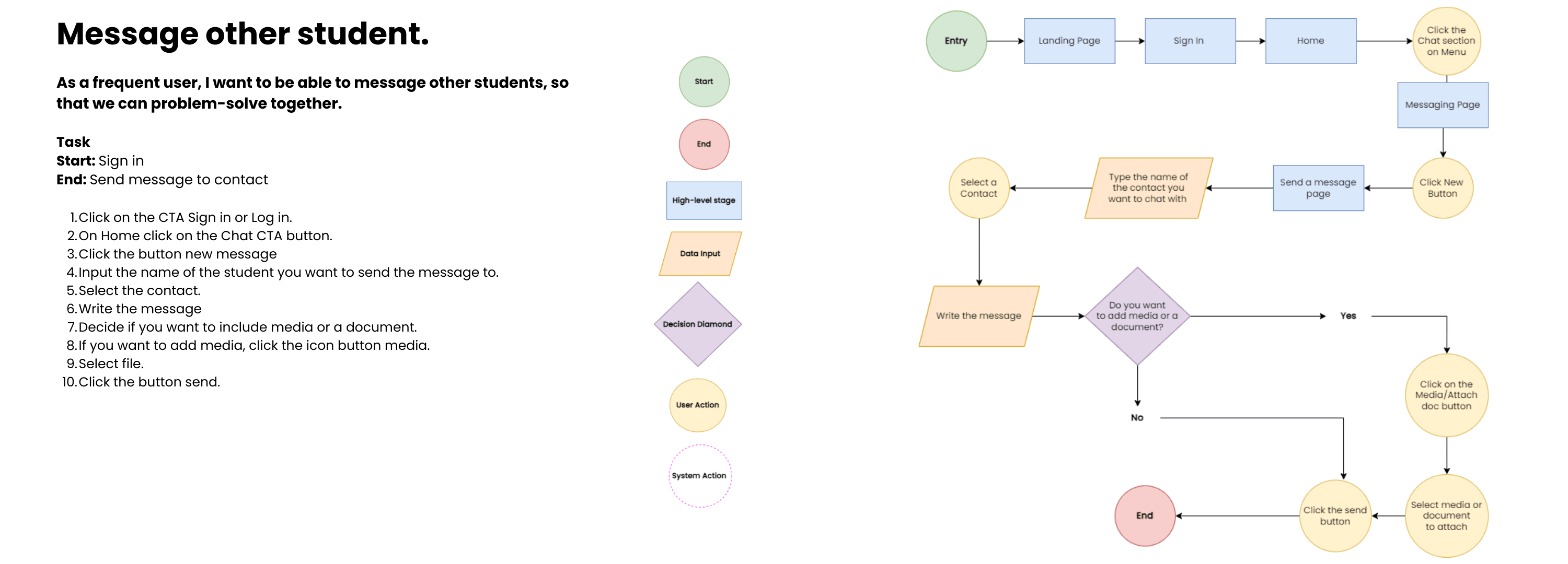
Message other student
The chat feature is one of the most important aspects of the web app because it enables students to connect with their peers directly. This facilitates sharing of ideas, documents, and collaboration. Including a search function further simplifies the process of finding and reaching out to fellow students, enabling users to focus on the primary task – communicating with their contacts.


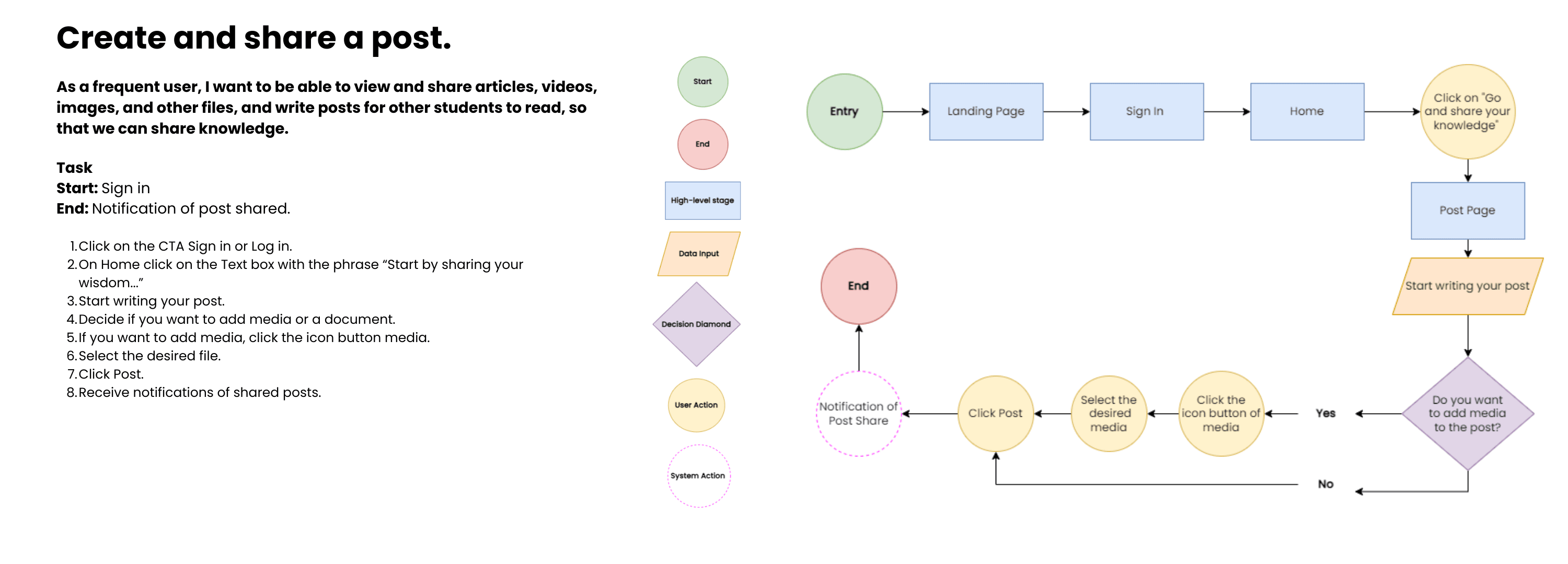
Create and share a post
The main purpose of the application is to enable students to share valuable knowledge. This can be done by posting in a feed where all the contacts can view, respond, and comment on the shared ideas. Including interactive features such as like, comment and share buttons makes the user experience more convenient and user-friendly. These features facilitate and enhance navigation, making it easier for users to interact with the content shared in the app.
Check it out yourself 📲
Responsive Design 🖥️
Throughout the whole project, I prioritised a mobile-first approach design process. After completing most of the style and visual work, I adjusted the design for tablet and desktop breakpoints starting with mid-fidelity wireframes to ending with High-fidelity wireframes.


Time to Reflect 🤓
This was a project focused more on the User Interface design part, which helped me learn as a UX designer to make decisions from a functional and visual approach on how to present the components in a way that is not only attractive to the user, but that makes sense within the overall user navigation.
However, the biggest learning and challenge was not considering everything as a whole for the responsive design phase of adapting to other breakpoints. My future self now knows that considering different breakpoints from the beginning will save me time on the whole design process.
What comes next?
Refine and finish
Refine the existing features and develop the others missing ones to have a completely responsive web app.
Test, test, test…
Run Moderated in-person and remote usability tests to know if the overall navigation and prototype are useful for the user. Modify according to the results and test again to ensure that the changes worked.
Finally
Before considering development and a Beta version, run an A/B and preference test to know more in-depth about the user’s preferences, and finally realize a functional beta version.