
Many people today seek to maintain or begin a healthy lifestyle and see health as an integral part of their lives. In their quest for this wellness where being healthy is paramount, healthy-conscious individuals use different applications to have healthy nutrition, exercise and, if possible, to follow up on their medical condition with a trusted doctor.
About the project
Meet Glowell- whose original name was Olive-a responsive web application that helps users record their medical information, search for specialists to book appointments according to their needs, and provides them access to educational wellness information to maintain a good balanced healthy lifestyle.
Let’s role my role 💃🏻
I chose Olive’s project brief to receive the UX designer certification from CareerFoundry. The learning and development started in March and ended in November. My role and responsibilities ranged from identifying the problem to creating a digital solution for the users.
My Responsibilities
- Defining and understanding the problem.
- Competitive Analysis.
- User research, analysis, and interviews.
- User Personas, journeys, and flows.
- Low, mid, and high-fidelity Prototyping.
- Usability Test plan and Script.
- Conducting Usability test studies: analyzing findings and making recommendations.
- Applying design guidelines and iterating on design.
- Usage of Figma and Marvel
Problem statement
Health-conscious persons need a way to record their medical data and receive wellness educational information because they want to maintain a healthy lifestyle and improve their habits to balance their day-to-day lives.
How can we design a digital solution that assists healthy individuals to record their medical data to maintain their health and improve their habits through wellness educational information?
Goals
Design a web-responsive app that:
Allows users to access the app in an easy familiar way to explore the app features.
Create a feature for users to introduce their medical data digitally.
Help users to search for specific wellness information and save it so they always have it at hand.
Give the user a simple way to search for a specialist, schedule an appointment, and archive it.

Competitive analysis
I chose 2 companies in the wellness and health industry, Doctoralia and Doctolib. My Analysis contains Key objectives, overall strategy, market advantage, marketing profile, SWOT analysis, and UX Competitive Analysis.


Understanding the user
To better understand my user’s needs and attitudes I conducted user interviews with participants in the 30-45 age range from different backgrounds. The interviews allowed me to identify that users need a way to digitally record their medical information and access it when needed, the obstacles that they face in finding online a doctor and appointments and that nutrition and exercise are the main topics that the users are interested in being informed about.
“It is quite important for me to be able to access my medical information easily and I would love to have a place where my medical information is virtually available”.
How much of a role does having access to your medical information or history 24/7 play in facilitating the tracking of your health?
“I would love to be able to find doctors that speak Spanish or English and more online appointment options”.
What are the obstacles or things that you find stressful or difficult when it comes to booking an appointment with a doctor or health professional?
“There is a language barrier that is always a problem. The second one is the health system itself because it works differently if you have a private or public one. Some doctors give this kind of preference”.
How easy or difficult was finding a trusty doctor with whom you feel comfortable to have a medical check-up?
“I would like to be better at it (nutrition). Whenever I eat the right food and don’t eat junk food, my body and everything feels better”.
How much of a role does exercising and nutrition play in maintaining your health?
Affinity among users 👨🏻👩🏼👧🏾👦🏽
With the data recollected from my users, I used affinity mapping to categorize my user’s data and labeled it into clear groups such as Digital medical information and sharing, online finding/booking appointments, preferences, and information, etc.
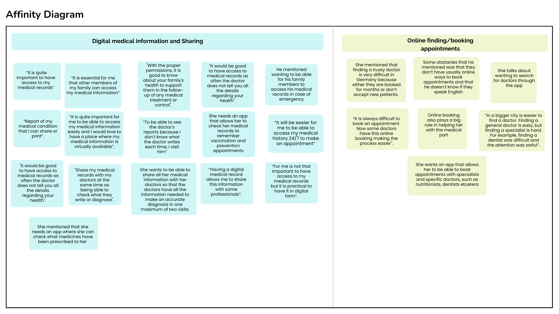
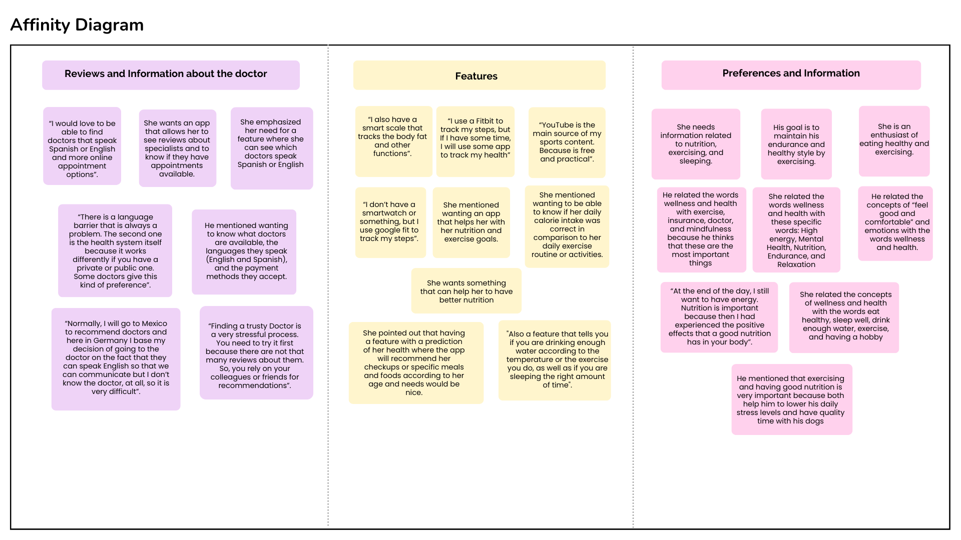
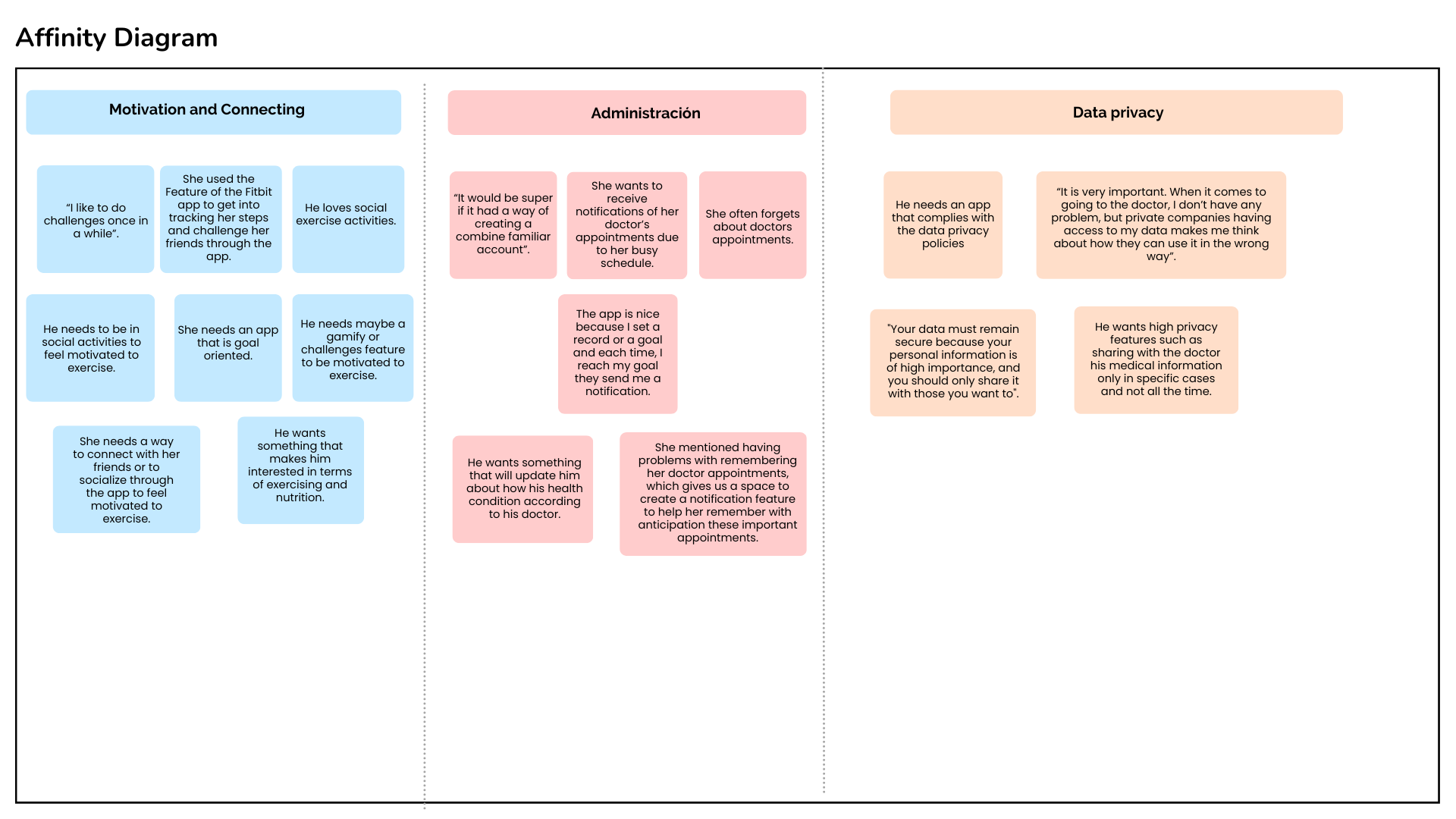
Based on the affinity map categories, I found that users consider health an integral part of their daily lives. In addition to providing a way to have their medical information digitally, delivering the opportunity to make appointments with doctors and share their information is key to meeting the user’s needs.
Insight #1:
Existing apps don’t allow the user to manage and administrate their medical information digitally and share it with their doctors.
Solution:
Feature on the app that allows the users to administrate their medical information and share it with their doctors.
Insight #2:
In Germany, most doctors don’t have an online way for users to book an appointment. They only have their webpages where you cannot check availability or doctor’s profile.
Solution:
Create a function where patients can see the availability of each health specialist (date and time), check the doctor’s information, and book an appointment.
Insight #3:
Users need a web-responsive app that provides them with the nutritional, exercise, and wellness information they need, so they use multiple sources to find it.
Solution:
Create a feature where users can search for nutritional, exercising, and wellness information, and save it to have it on handy.
Let’s get to know our people.
Due to the results of the user interviews, I understood users’ attitudes related to recording their health through a web application, receiving educational information to stay healthy, and struggling with booking doctor appointments. These data gave us enough information to create two user personas to guide us in developing the project.
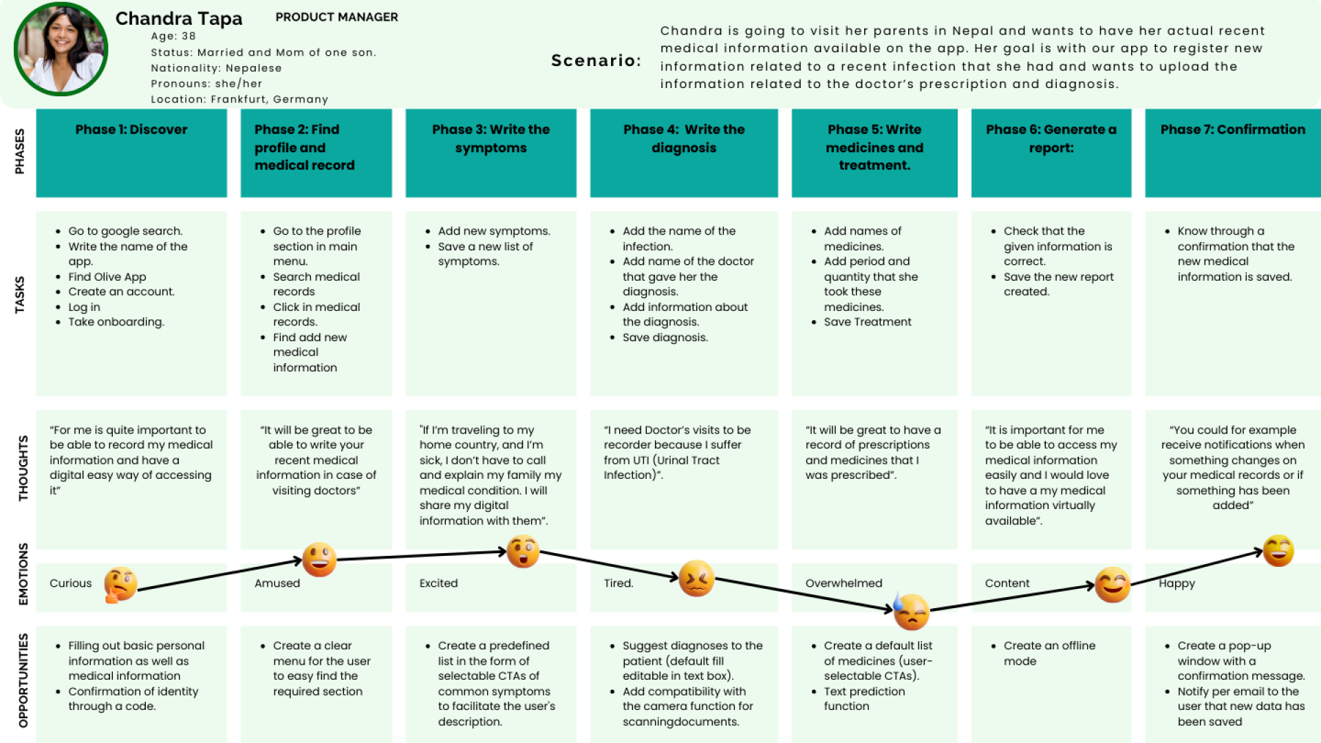
Meet Chandra

Get to know Héctor

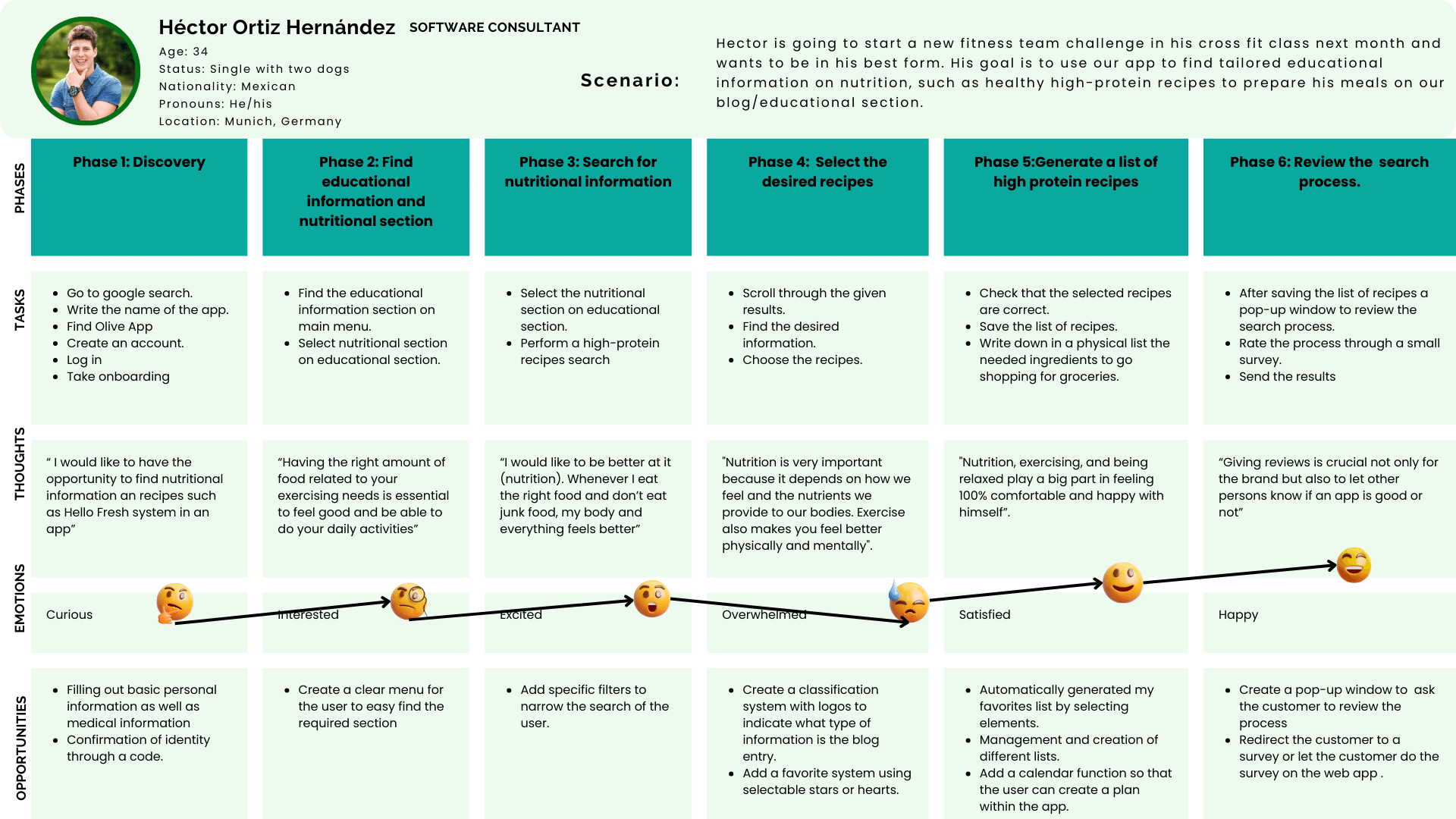
Let’s journey with our users 🎢
My objective was to have a story to visualize the process each one of my personas goes through to accomplish a specific goal. Each journey contains specific phases, the tasks to be completed in the process, emotions, thoughts, and opportunities to address the user’s needs in each phase. I focused on identifying the specific goals of each of my personas and used quotes and experiences from my user interview information to capture the actual emotions and thoughts that the user experiences in each step.
Going with the flow 🚣🏻♀️
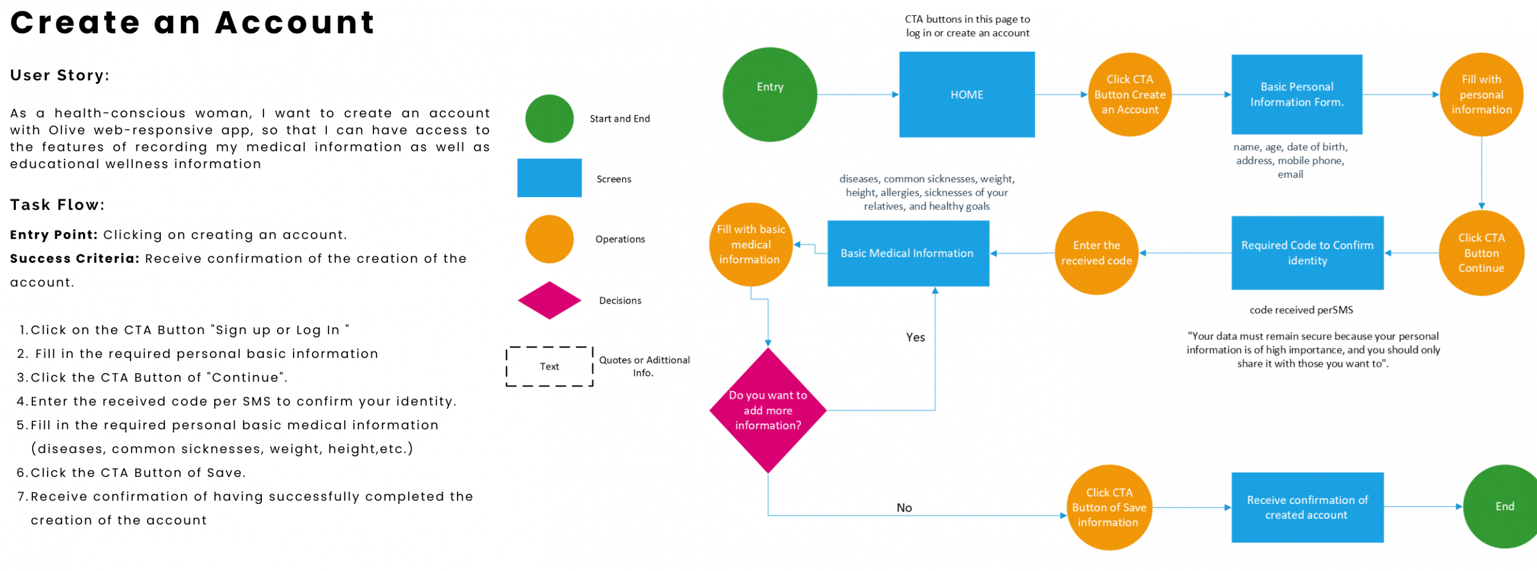
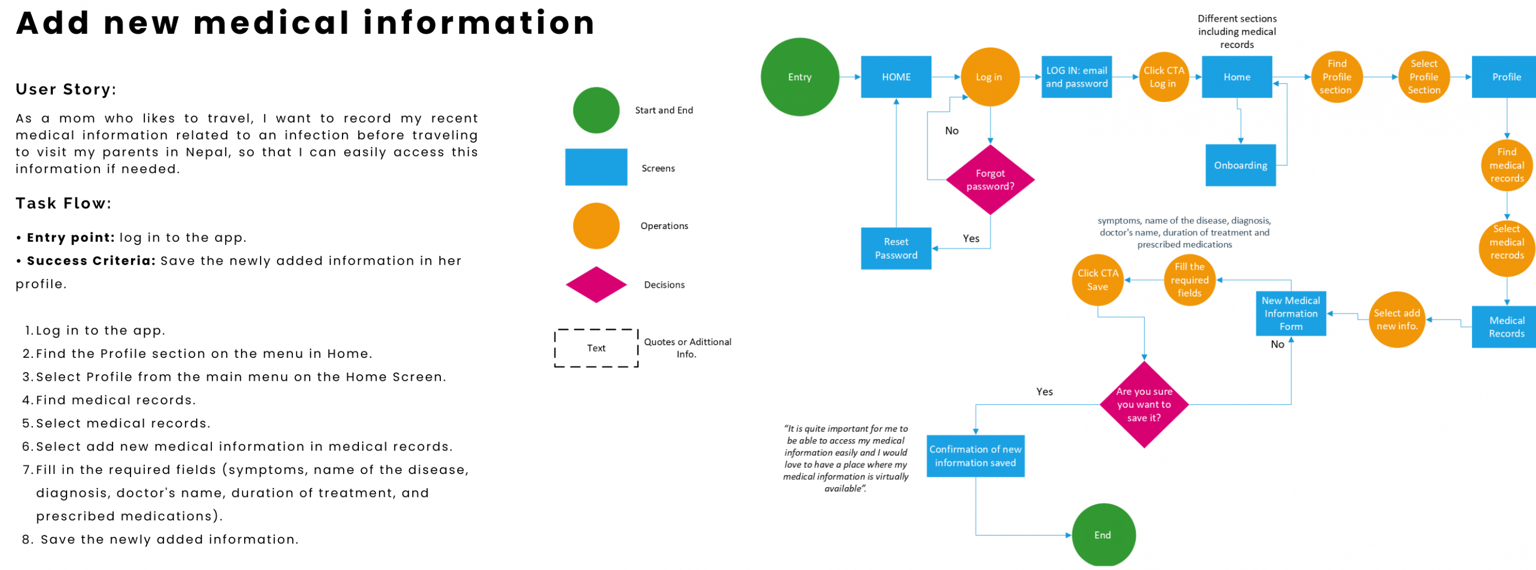
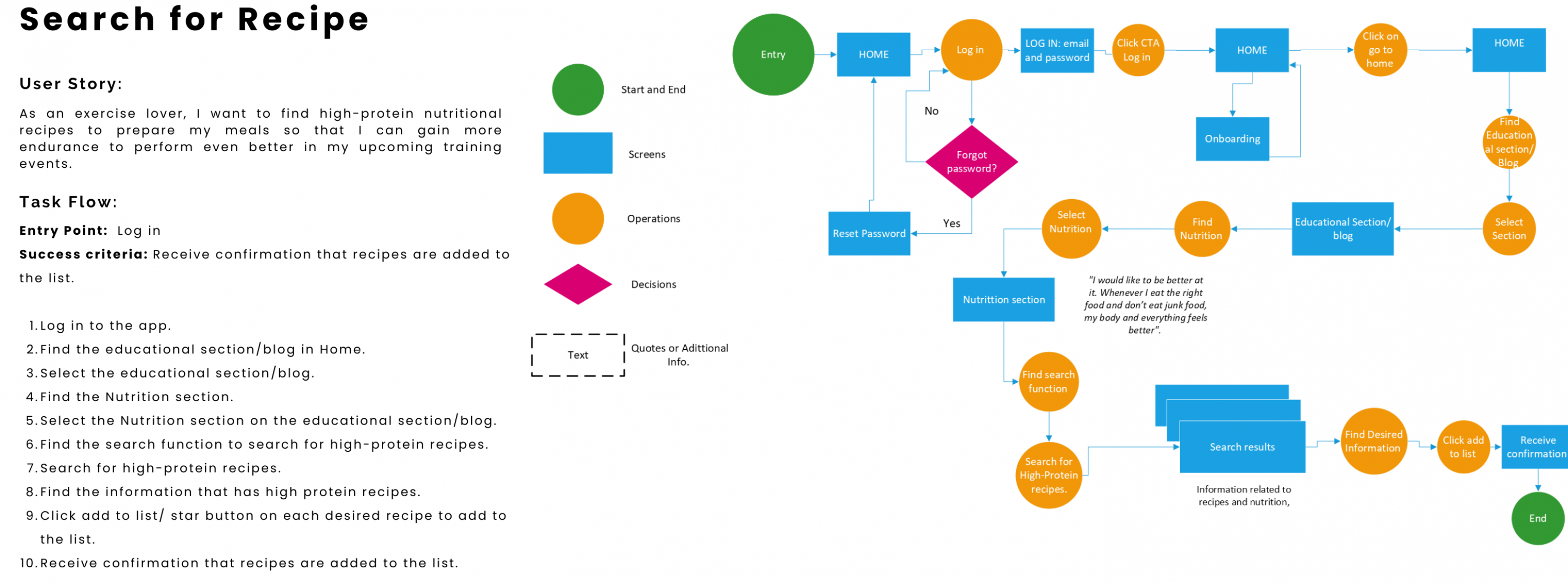
As a result of the obtained and analyzed data I encountered four ways to help our users to maintain and improve their healthy lifestyle that defined our main features for the responsive web application: create an account, record new medical information, find high-protein recipes, and Book an appointment.

Sitemap of responsive web application
After creating an initial sitemap, I conducted a hybrid card sorting study using Optimal Workshop. Users were given the option to create new categories if needed, aside from grouping the cards into given ones. As a result, I gained clear insights about which structure and relation between pages/subpages are familiar to the users, on which pages to place certain features and validate the already established page organization by providing intuitive navigation.

Glowell Sitemap

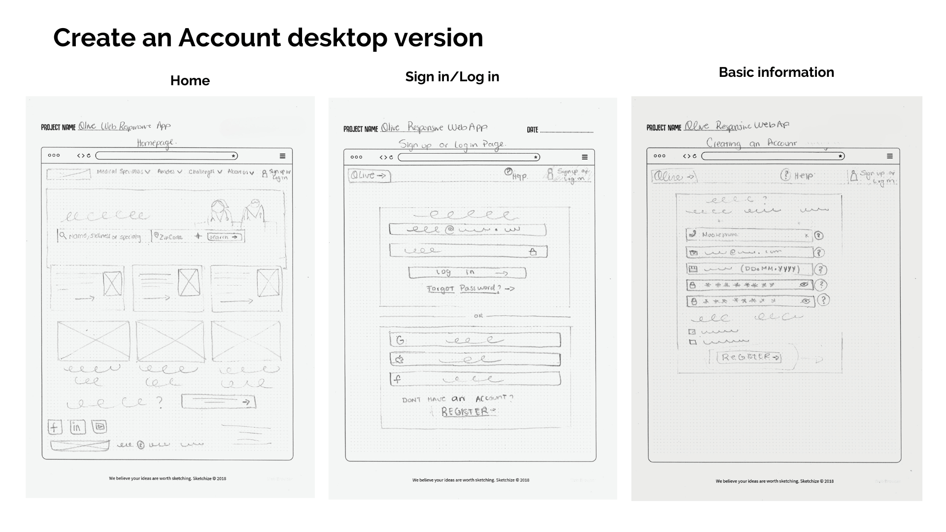
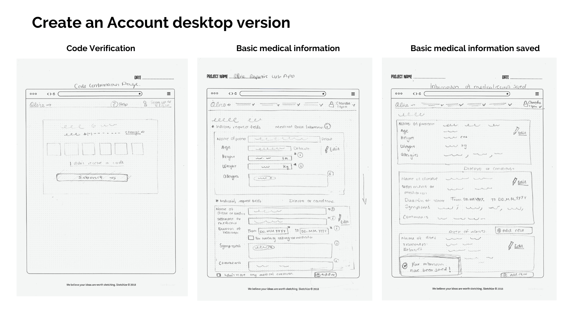
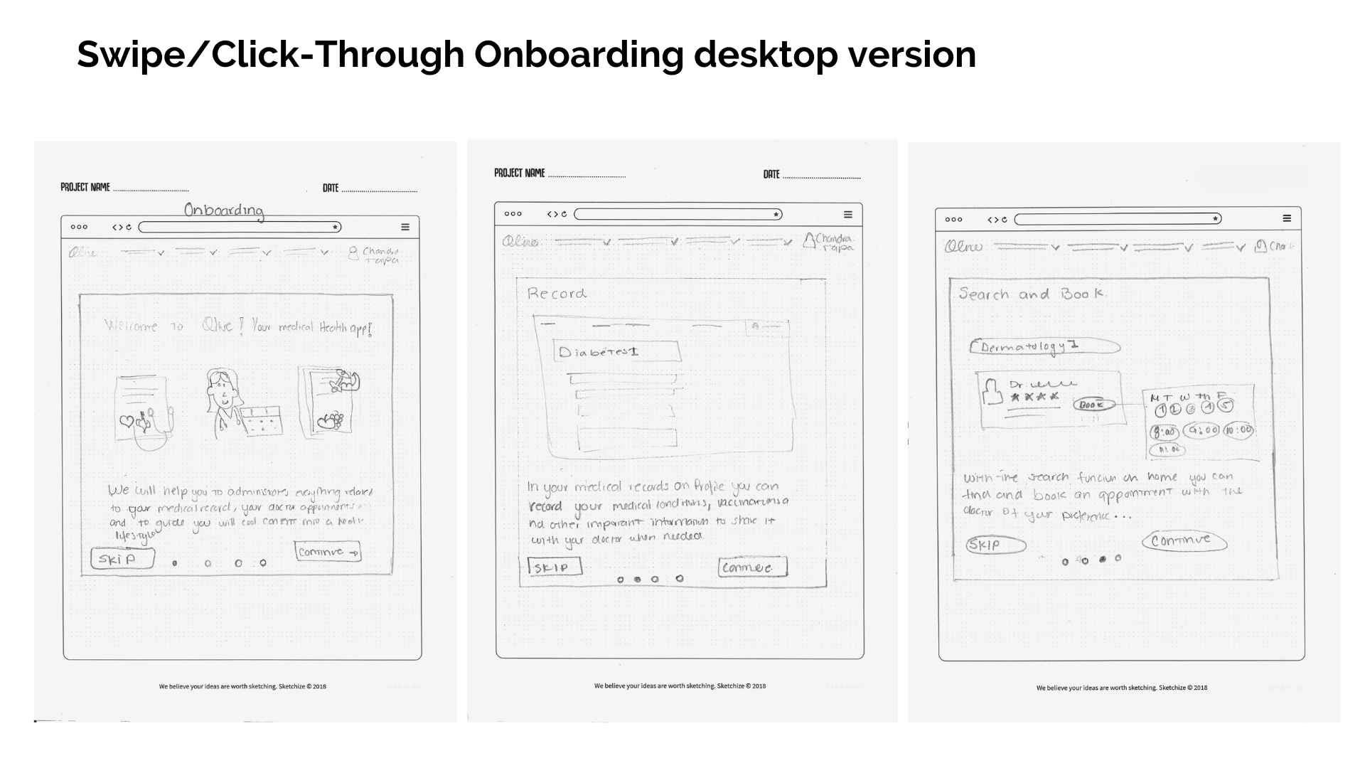
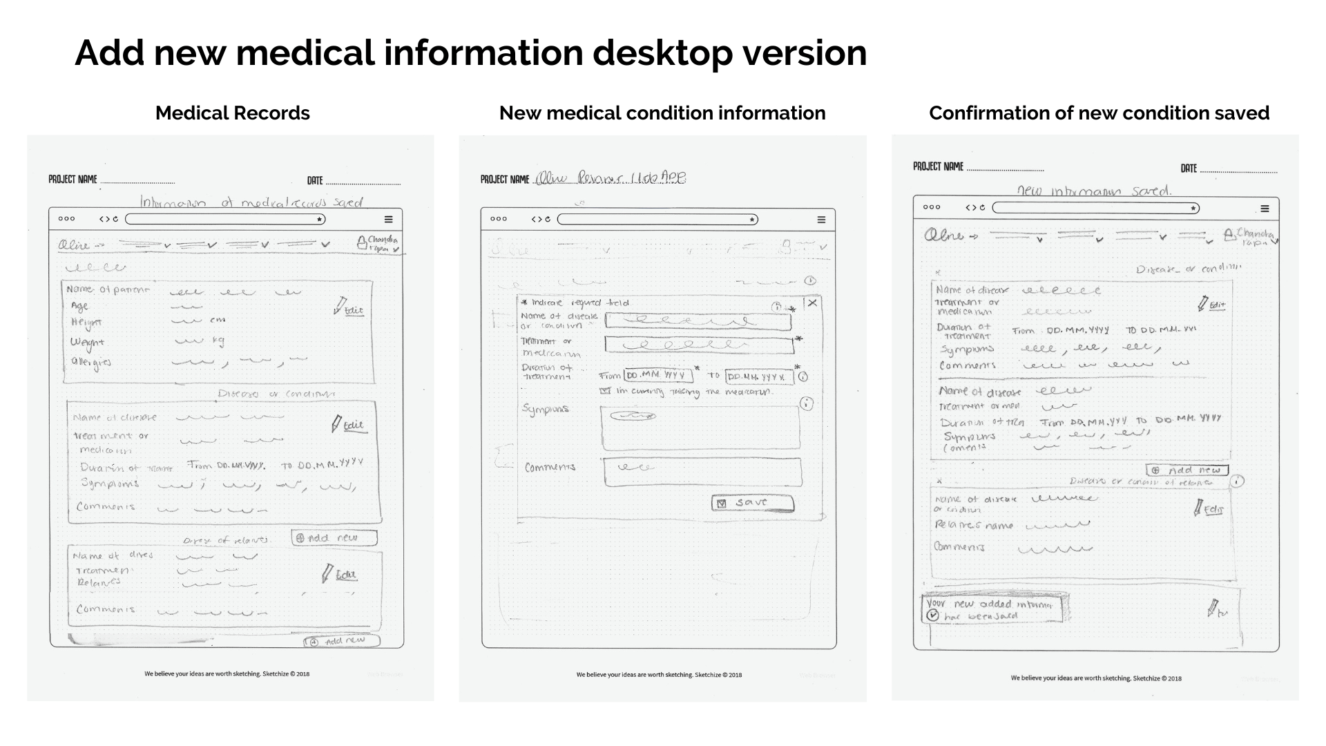
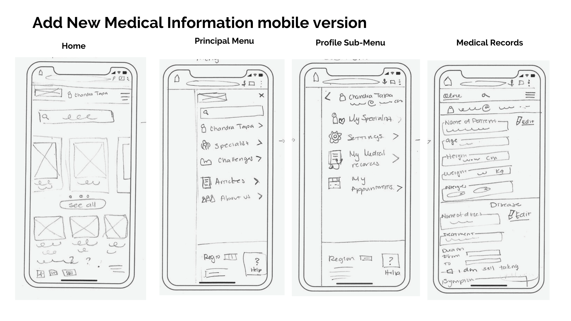
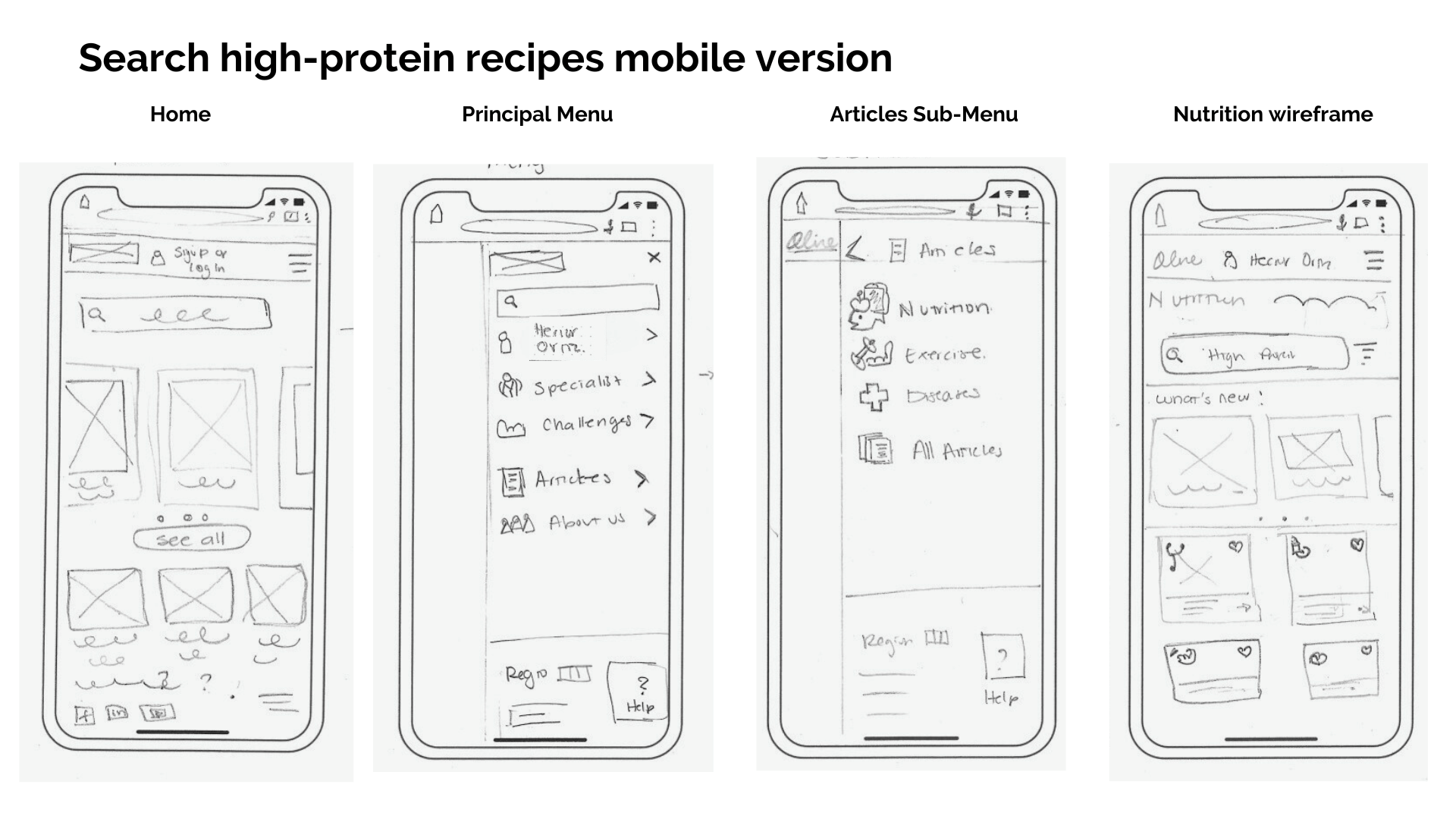
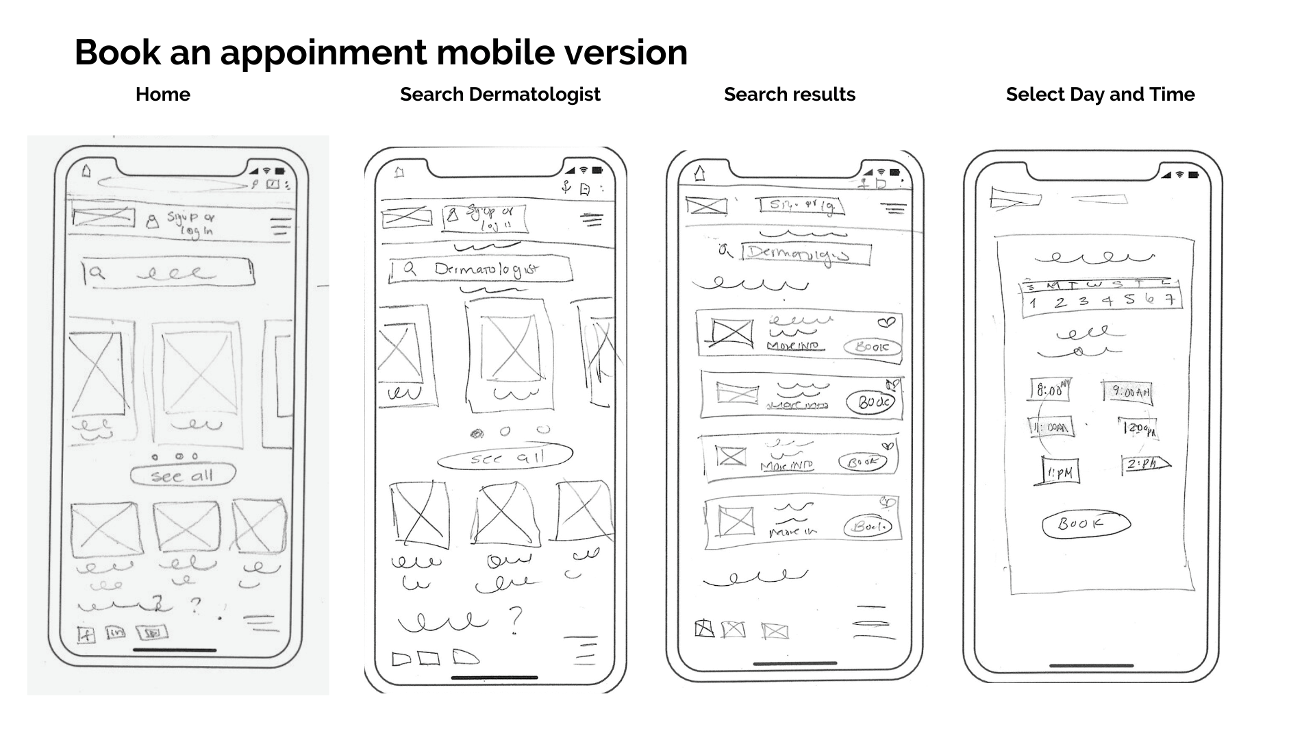
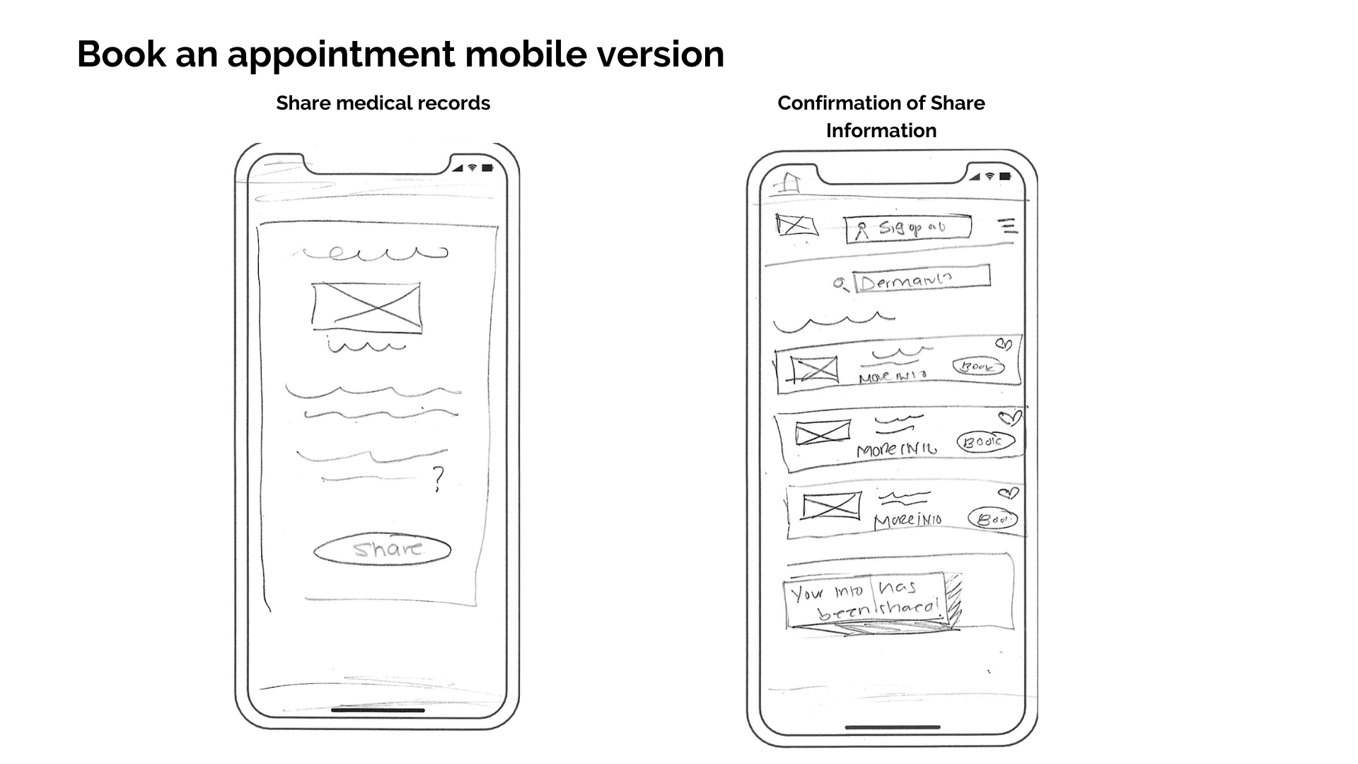
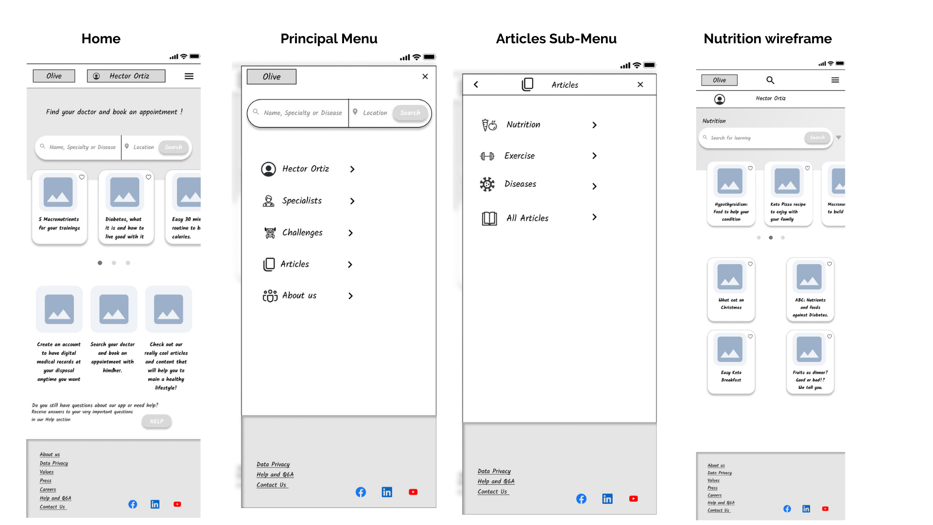
Low fidelity: the classic but reliable paper and pencil 📝
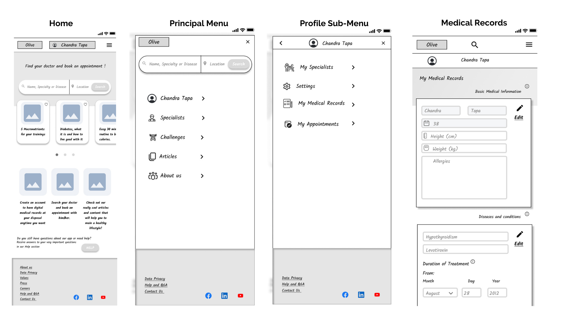
I decided to focus on the mobile-first design due to the easiness of today’s users accessing a web browser from the comfort of their cell phones and the fact that our users are busy people who most likely use the mobile web version more than the desktop one. I focused on capturing the basic wireframes of any web application, emphasizing the general navigation of the already mapped user flows. My objective was to visualize the way users would interact with each core feature, button, and wireframe.
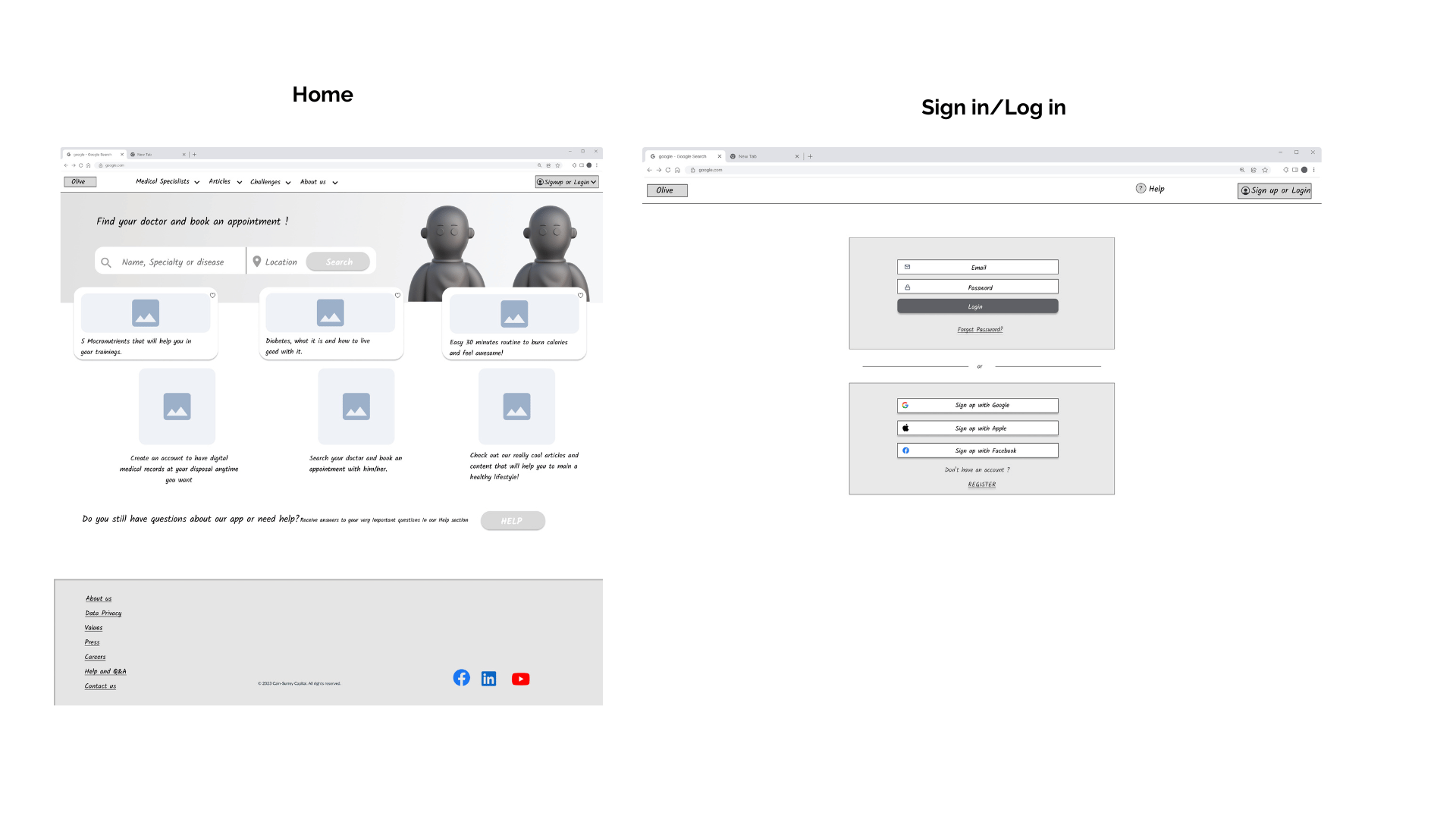
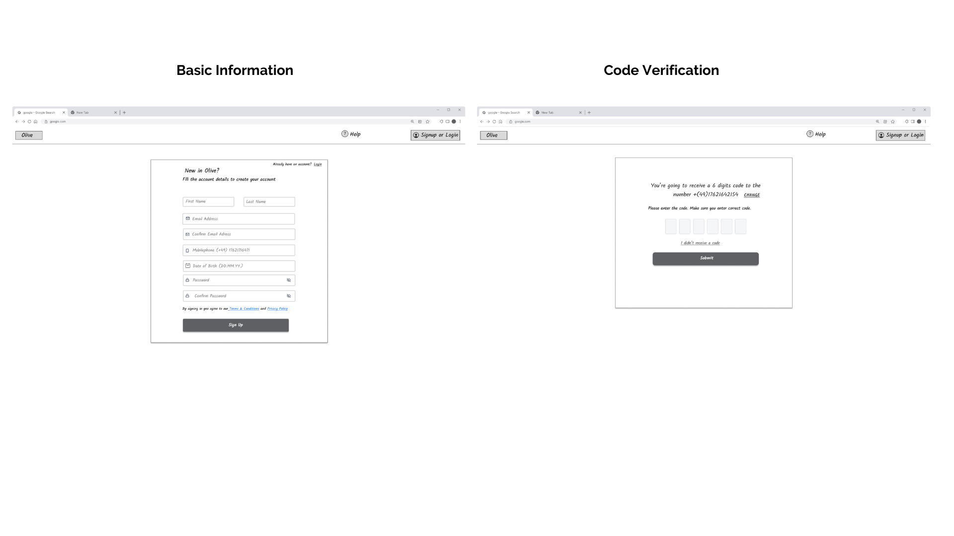
Mid-fidelity wireframes: digitizing and detailing 👩🏻💻
After having a clear general idea of the overall navigation and interaction, I learned how to use Figma to create detailed wireframes conveying form, and function, creating specific UI elements to shape the layout that would greatly influence the user’s navigation, interaction, and completion of the goals of each user flow.
High-fidelity and prototype: the same but clickable 📱
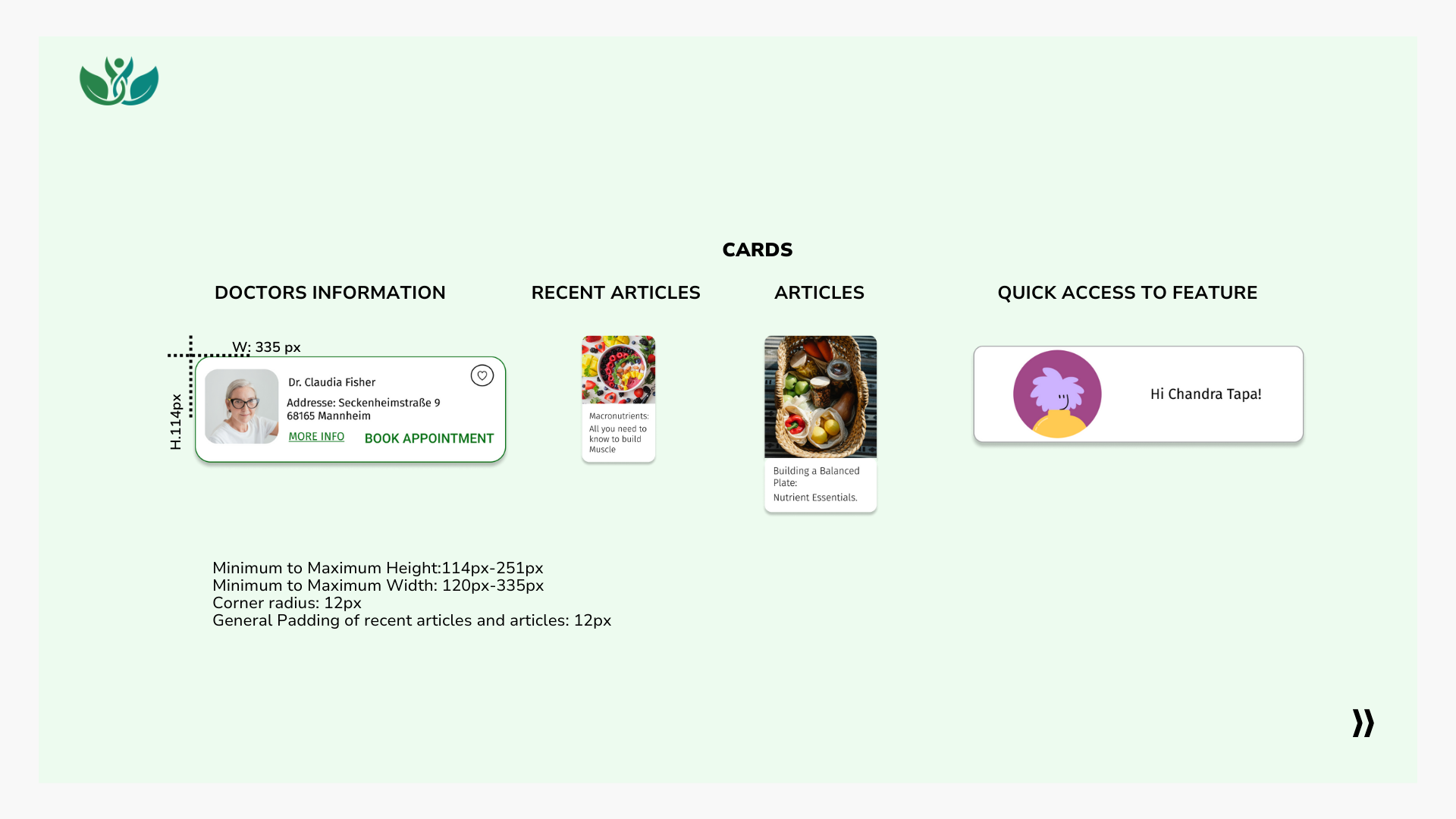
At this stage, I refined the wireframes and modified some UI elements such as cards and buttons, checking their position, and the general navigation. I changed the font of the design to improve the readability of the prototype, added a logo, substituted the image holders with real images, and made sure that the MVP (Minimum Viable Product) was functional to later use it in my usability tests.

Screens of High-fidelity prototype.
Let’s test this baby 📲
I conducted six usability tests: three moderate in-person usability tests and three moderate remote usability tests (MS Teams). My participants were asked to complete four scenario-based tasks to test the prototype’s core features, functionality, and general navigation.
1. Using the Olive web application create an account to be able to access all the other features of the application.
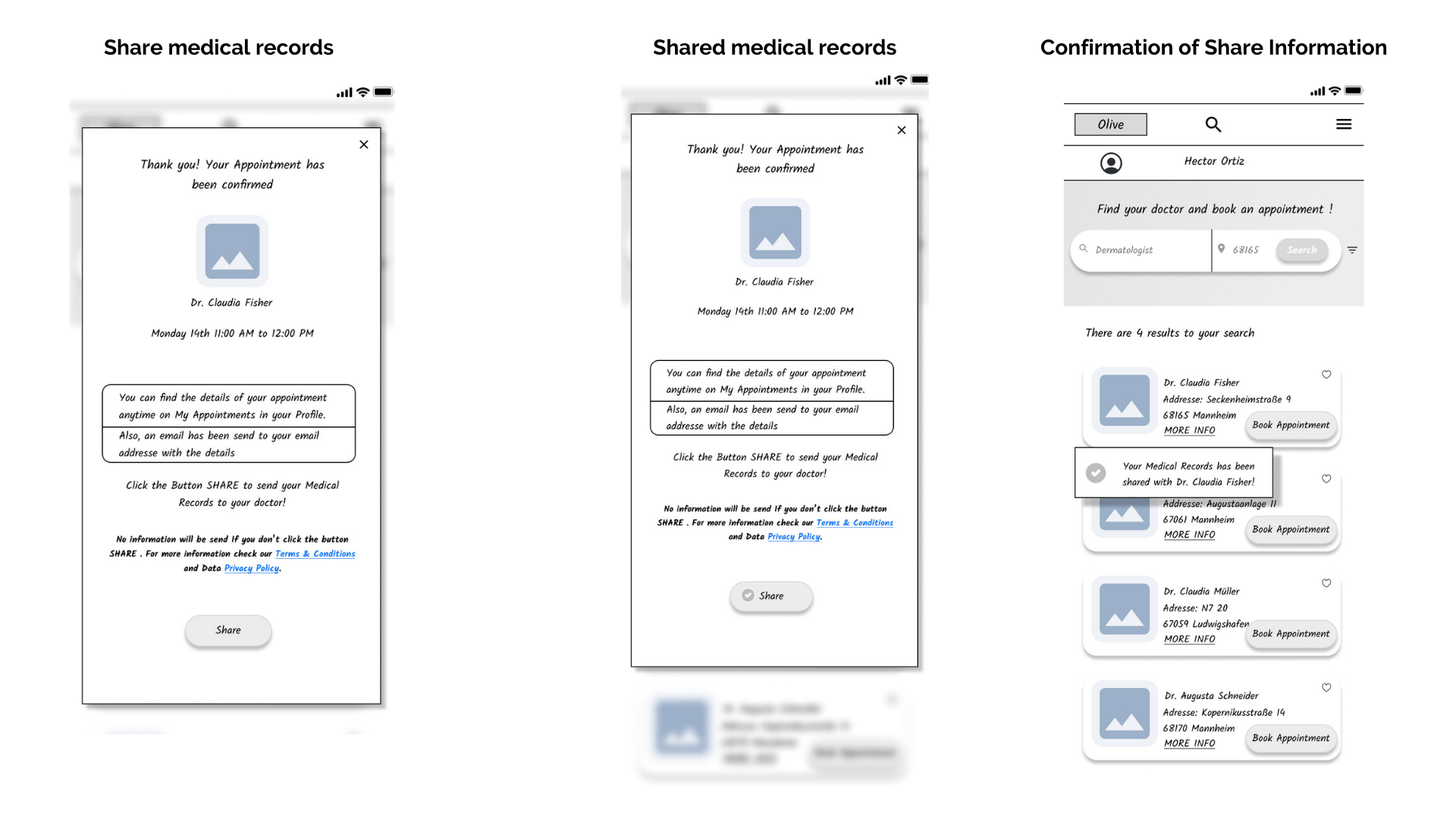
2. You got sick on your trip, were diagnosed with an illness, and given medication. Add this new information to your existing medical history in the app.
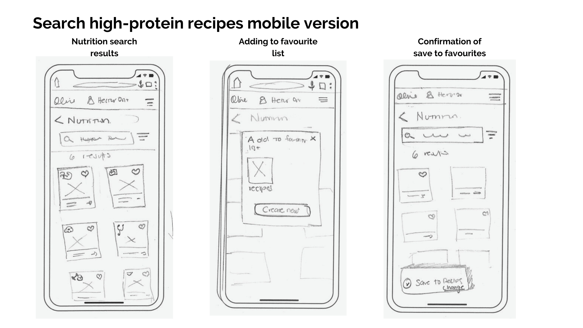
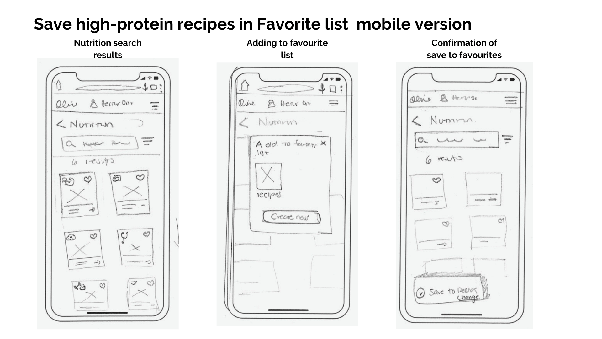
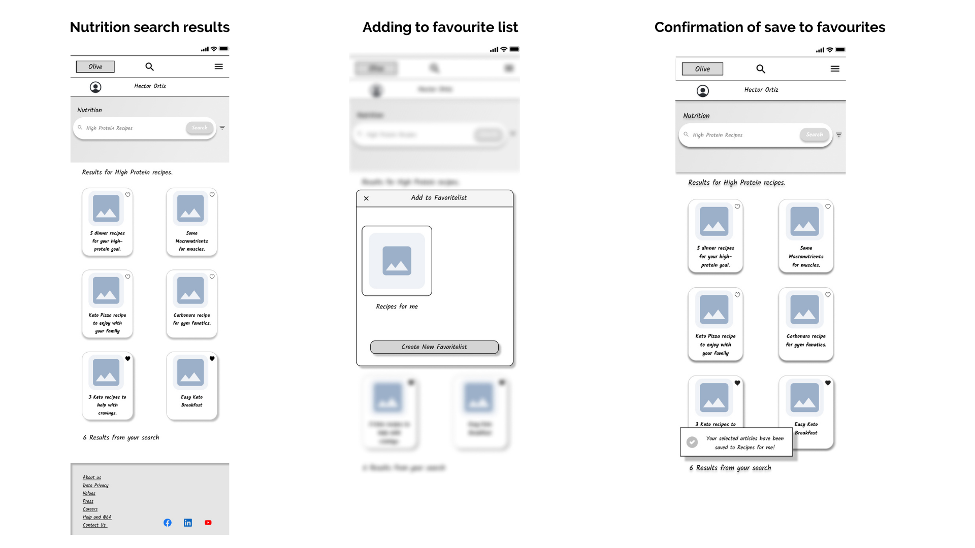
3. You want to increase your protein intake and look for high-protein recipes and want to save them. Search for high-protein recipes and save them to your favorite list.
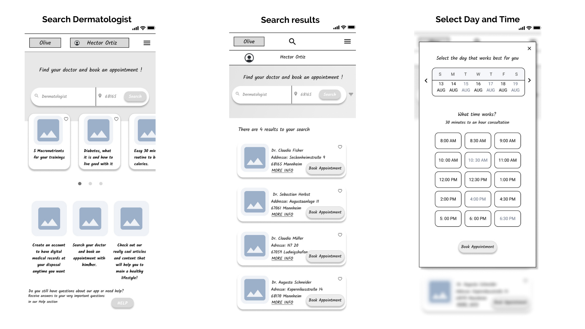
4. You have hives on your hand, and it’s irritated and itchy. You want to find a dermatologist to make an appointment. Find a dermatologist and schedule an appointment.
What did I find? 🔎
With the information from the tests, I used affinity mapping to isolate data into errors, observations, and positive and negative quotes to visualize patterns classified into specific categories. With the rainbow spreadsheet, I rate the severity of the errors and negative comments to propose and apply solutions to fix critical errors in the prototype.

Change 1: Reorder Home UI elements (Cards articles) and create shortcuts to core features.
The user’s attention was captured by the article cards. They clicked on the core features description thinking this was a Call to Action Button (CTA). The relocation of UI Elements drives users’ attention to the new CTA buttons of core features, simplifying their navigation through the responsive web application.


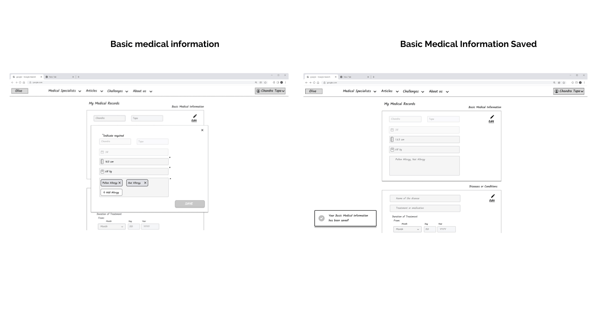
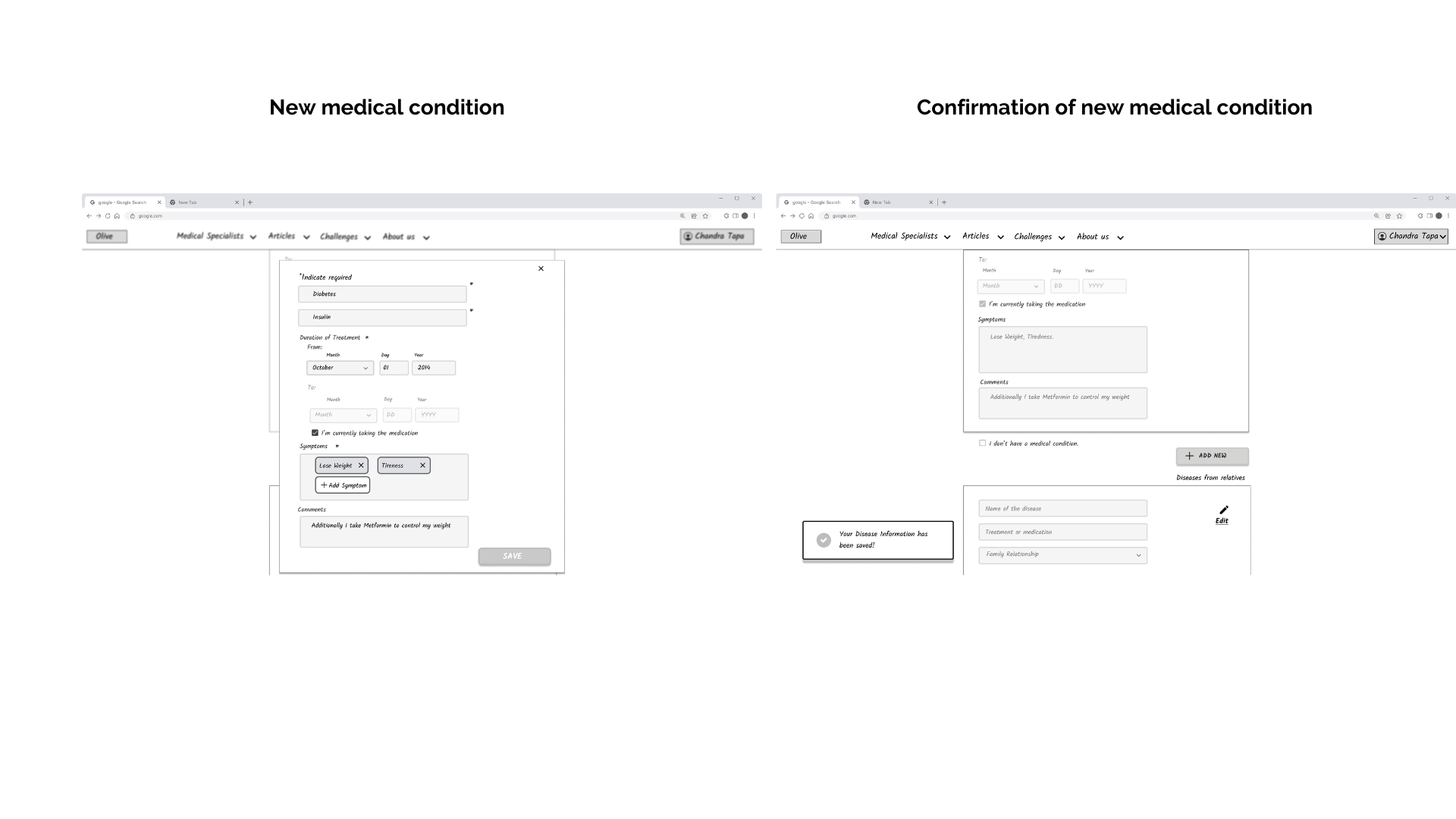
Change 2: Redesign the Filling Basic information Wireframe
Before, the user would be redirected to the part of medical records without information on what action to take, creating discomfort in the user’s experience. Creating a Basic medical information wireframe and adding a last confirmation wireframe gives to the user a more familiar navigation.
Change 3: Rearrange the steps of the user flow to create an account including new explanatory wireframes.
After filling out basic information, users were confused when instantly redirected to the progressive onboarding. Putting the Onboarding after the code verification, then the redesigned basic medical information wireframe, and at the end the confirmation wireframe, gives the user comfort and a sense of order in the navigation.


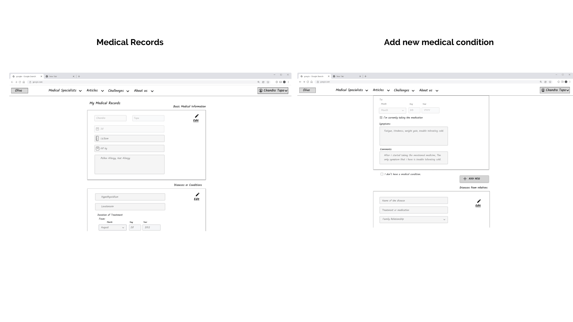
Change 4: Redesign (create a combination of logo and text like the Edit Button) the Add New Button and put it down the Edit button.
Users had difficulty finding the add new information button on medical records. Redesigning and repositioning the add button makes the user perceive the button more quickly as well as improves users’ navigation.
Change 5: Shorten the process of adding to the favorite list by using a notification as confirmation of the process.
The users felt that the number of clicks to add to the Favourite list was too many. By shortening the process our users would feel more comfortable and with the notification of adding to the list and removing it, they would have a familiar system found in other apps.

Check the Prototype with changes
Work it harder, make it better ⚒️
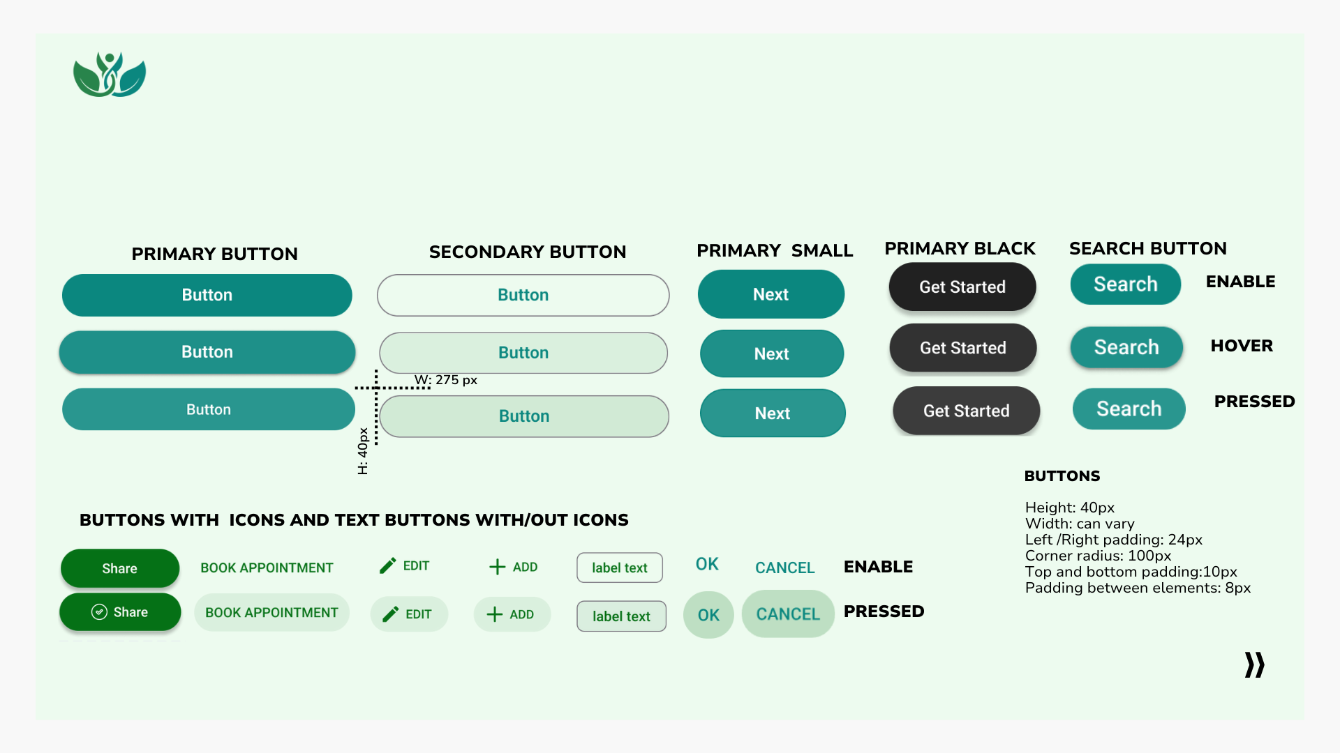
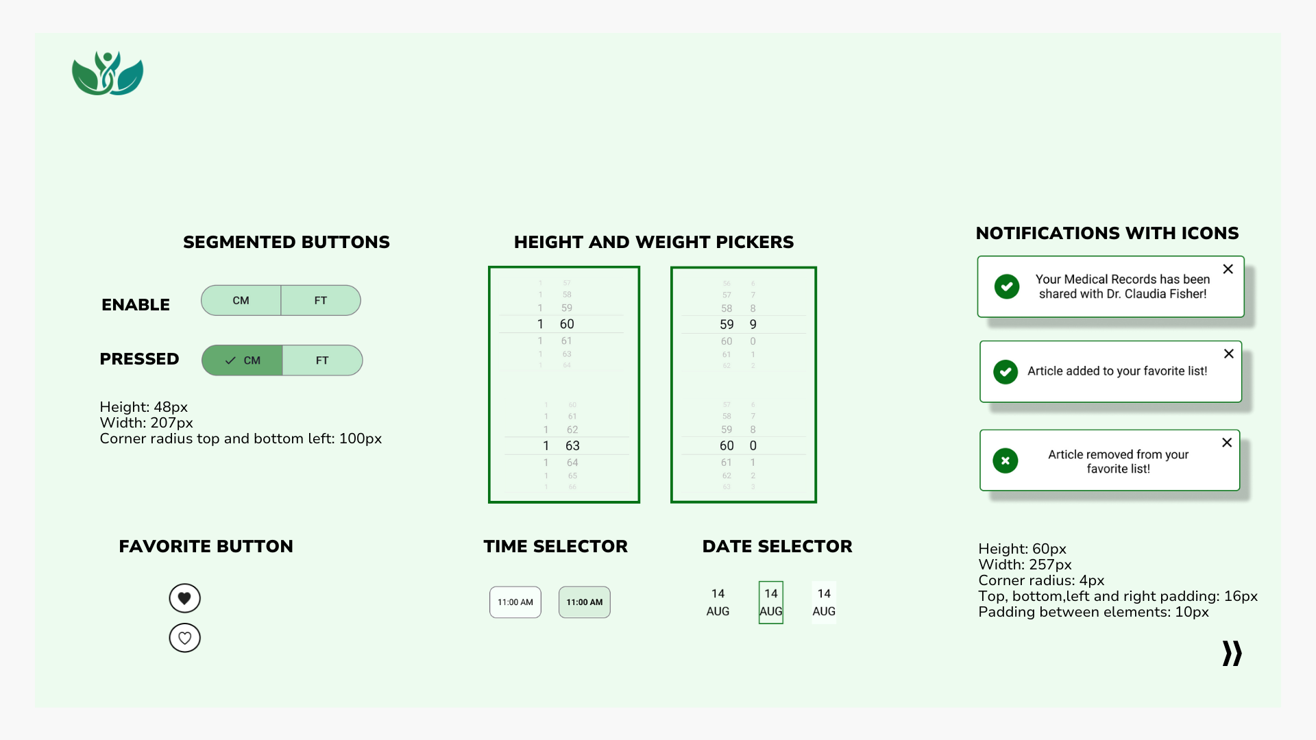
For the app, I decided to use a combination of blue and green, because of its association with health and wellness and to evoke calm, confidence, and welcome to the users. The use of these colors in UI elements and specifically in the primary and secondary buttons is to emphasize and guide the users to the points of interaction required to complete the tasks.
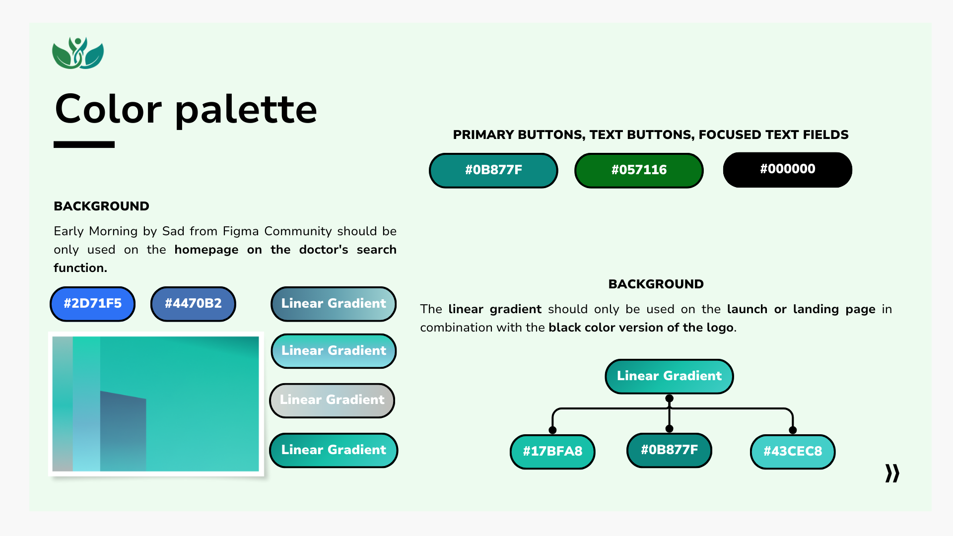
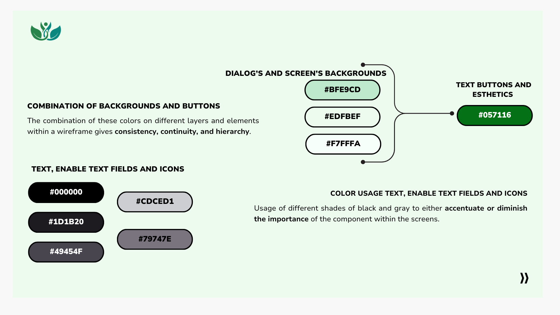
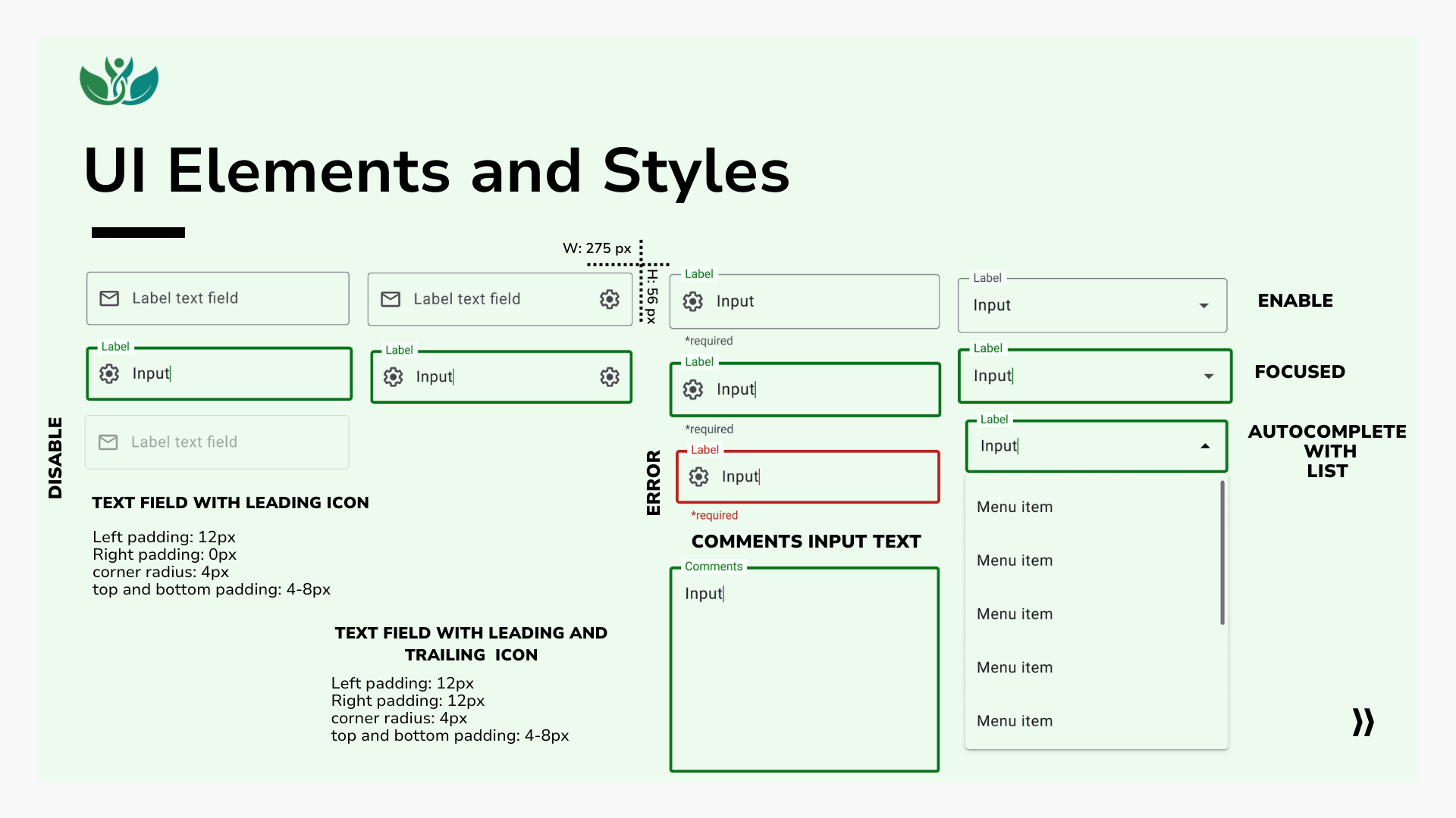
After reviewing the material design guidelines and my usability test results, I made substantial changes to the UI elements throughout the application to comply with the recommendations mentioned on the guidelines. Additionally, I requested feedback on the Slack community from my peers to make any necessary changes that I had overlooked.


Access for everyone 🧑🏽👩🏻🧒🏾
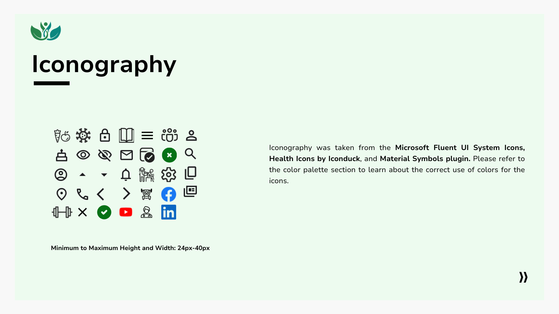
I based on the guidelines indicated by the WCAG to make the responsive web application more accessible. The most important to achieve in this case were:
Contrast: Comply with the 4.5:1 ratio in each of the wireframes of the app so that the user can perceive in a simpler way the two CTA buttons and the actions to be performed.
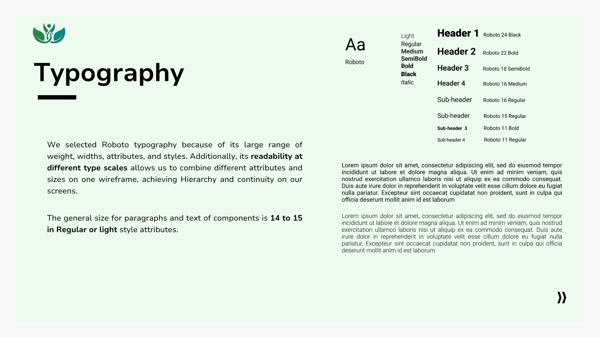
Text alignment and size: Text alignment to the left and a minimum font size of 12 to improve the readability of the wireframes.
Writing: Review wireframes such as the Onboarding part and use easier words so that anyone can understand the concepts.
Progress indicators: In the onboarding, we put these indicators to help in the navigation to the user.
Bringing you GLOWELL responsive web app 👏🏻
Check it yourself! Final Prototype with Figma.
Time to reflect 🤓
As I went through each of the phases of the project while learning more about UX design, the biggest challenge was to stop looking at the whole picture of creating an application and understand that it is a process; it involves focusing on specific steps per phase (UX research, personas, sketching, prototyping, testing) that together make one idea turn into a great project full of effort and work. Take one phase at a time.
Continuous learning path
Hey! I learned in a short time how to use Figma-level unlocked!🏆 Putting that topic aside, I experienced the importance of doing usability tests; your users are the best judges of your work. Understand that iteration is necessary to achieve a functional, user centre product and, that being open to feedback from other colleagues will always add more than it will take away.
What is next?
Refine and Add features
- Refine the search function of doctors with the filters and put more specific details in the information of the doctors.
- Add filters to the search function of nutrition and include some labelling on the article’s cards.
Another round of…tests
- To refine the final prototype and get a better understanding of our users, I need to conduct 6-10 moderated usability tests either in-person or remotely. Moreover, we need to arrange a preference test to observe the specific details of users’ preferences and further polish the design.
Last changes
- Before launching the beta version of the app, be sure to perform a final check on each wireframe to ensure compliance with accessibility guidelines and make any necessary modifications.